| Image |
Comment |
| 08/07/2004 01:08:44 PM |
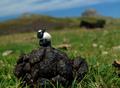
Oops...by paynekjComment: I can't tell exactly what your miniature object is. Is it a small bird? Sheep? |
| 08/07/2004 01:07:27 PM |
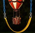
Shameby wwwavengerComment: Very imaginative. But, you did not "compose and photograph" the little guy. |
| 08/07/2004 01:04:04 PM |
Around the Yard in 80 Minutesby soccerdadComment: Excellent composition! And exposure. And Focus. The colors really pop out of the rich black background. You have a real winner here - most likely headed for ribbonland. |
 Photographer found comment helpful. Photographer found comment helpful. |
| 08/07/2004 12:45:45 AM |
Breath Of Fireby jmsetzlerComment: Exceptionally artistic! Perfect composition and superb lighting. The range and value of colors is stunning. If this doesn't win a ribbon, consider yourself robbed. |
| 08/05/2004 02:57:06 PM |
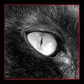
Stareby TiberiusComment: GREAT B&W closeup! The detail in the fur and the eye is spectacular. Exposure had to be difficult with so much dark area - but you nailed it. Having said all that - your gaudy border is absolutely terrible and should be quickly destroyed. |
| Photographer found comment helpful. |
| 08/03/2004 05:17:23 PM |
|
| Photographer found comment helpful. |
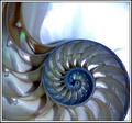
| 08/03/2004 05:16:37 PM |
Nautilusby flip89Comment: One of nature's mort graceful objects for sure. The shell itself is wonderful but the large white area at the top right is really terribly distracting. Your multi-layered border is yucko for me. |
| Photographer found comment helpful. |
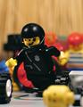
| 08/03/2004 05:07:37 PM |
Legoland's Finest - LLPDby troyloxComment: Cute. Perfect focus on the figure - but somehow you needed to prevent the terrible OOF yellow blob in the foreground. Good exposure and vibrant colors. |
| 08/03/2004 05:06:27 PM |
Peppercorn Blendby OneSweetSinComment: Wonderful idea. Your image has several things going for it including: Great flat lighting, perfect exposure, nice combination of colors, and nice combination of textures. On the down side, it lacks a bit on the composition. One of the colored peppercorns - probably a green or red should have been positioned at one of the critical "crash p[oints." In addition the green and red ones on the top edge should not have been cut in half - but it is quite ok for the really dark ones. Having said that - it has more good qualities than improvement areas - so nice job! |
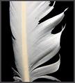
| 08/03/2004 01:37:19 PM |
Old Feather Quillby drydocComment: Exceptional lighting and textures. Black background is perfect. I like the fact that the feather has some small imperfections. Two suggestions for improvement: 1) A more diagonal placement and 2) dump the border. |
| Photographer found comment helpful. |
Home -
Challenges -
Community -
League -
Photos -
Cameras -
Lenses -
Learn -
Help -
Terms of Use -
Privacy -
Top ^
DPChallenge, and website content and design, Copyright © 2001-2026 Challenging Technologies, LLC.
All digital photo copyrights belong to the photographers and may not be used without permission.
Current Server Time: 07/25/2026 11:21:23 AM EDT.