| Image |
Comment |
| 06/17/2002 08:39:00 PM |
elevatingby defrostedComment: Whoa, you're going to get hung out to dry for this one, but I see where you're comming from. I love the graphic design and the textural elements that tie the photo together. |
| 06/17/2002 01:31:00 AM |
Ellie Phunt's Shadowby David EyComment: Interesting concept. I like the texture on the Ellie Phunt's back and the way the light dies off on the right. It would have been nice if you could have controled the light source a little more and not burned out the top of his (her) head. |
 Photographer found comment helpful. Photographer found comment helpful. |
| 06/18/2002 12:18:00 AM |
|
| Photographer found comment helpful. |
| 06/17/2002 12:44:00 PM |
Sunny Delightby ShiiizzzamComment: Nice composition and exposure. Good use of DOF. I like the interplay of colors and textures. |
| 06/17/2002 02:28:00 PM |
|
| 06/17/2002 01:29:00 PM |
Yea, though I walk through the valley of the shadow.....by MrsKroComment: Nicely composed photo. I think it's a little over sharpened, as I can see some unsharp mask effects on high contrast boundries. I don't know what ISO you used, but there's some noise in the flat color areas. Actually though, I think it gives an interesting texture to the sky and the shadow in the belfry. |
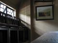
| 06/17/2002 01:33:00 AM |
Pelican Innby mjsullComment: Very nice use of light. You controled the exposure very well and kept the subtility of the texture on all surfaces. Overall, a good interior. |
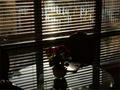
| 06/17/2002 08:33:00 PM |
La Florby GotchaComment: An excellent concept, very nicely done. I even like the sun blooming on the blinds and burning out the paper on the desk. If I were to make any suggestions at all, it would be to expose about one stop lighter, let the outside world burn some and pick up a little more detail in the flowers and the vase. If it wern't for the restraints of the composition you could have easily done some local manipulation, it looks like there's enough data in the shadows. |
| Photographer found comment helpful. |
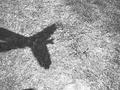
| 06/17/2002 12:46:00 PM |
Flying Handsby bmacComment: The composition is unbalanced with the hands on the left side. Poor exposure. |
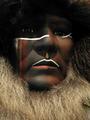
| 06/17/2002 12:41:00 PM |
face in a windowby GinaRothfelsComment: We used to call this 'Frankenstein Lighting' in photo school. You should be gald it's a manikin or she would've killed you. Good shot though. |
Home -
Challenges -
Community -
League -
Photos -
Cameras -
Lenses -
Learn -
Help -
Terms of Use -
Privacy -
Top ^
DPChallenge, and website content and design, Copyright © 2001-2026 Challenging Technologies, LLC.
All digital photo copyrights belong to the photographers and may not be used without permission.
Current Server Time: 06/11/2026 04:49:49 PM EDT.