| Image |
Comment |
| 06/24/2002 10:52:00 PM |
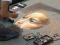
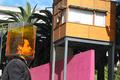
A picture of a drawing of a portraitby adak69Comment: I'll give you a better score than I'd give him:) This, to me, is one of the few pictures that really show the personality of the city. It tells it's story very well. Technically, good exposure and composition. |
| 06/25/2002 09:23:00 PM |
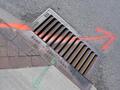
Gateway to the Undergroundby tjpierreComment: I like the idea of this photo very much. The only things I could say against it is that I think it should have been framed a little looser in order to get in the whole casting, and it would have been nice if the color was a little darker and more saturated. I subtract 1 for each = 8. |
| 06/24/2002 11:41:00 PM |
|
 Photographer found comment helpful. Photographer found comment helpful. |
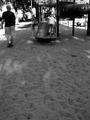
| 06/24/2002 11:00:00 PM |
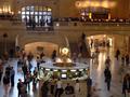
Past Rush Hour by BeeGeeComment: Nice crowd shot. The motion blur is just right to convey your point. |
| 06/26/2002 04:49:00 PM |
Drowningby drewmediaComment: Interesting idea and interesting effect, but why? What isthe picture trying to illustrate? |
| Photographer found comment helpful. |
| 06/25/2002 09:11:00 PM |
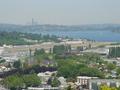
Renton, Seattle, Airport, etc.by SwashbucklerComment: Nice view of Renton and Lake Washington. I do think however the photo would have benifited by one stop less exposure. It would have compensated for the haze and added a little color density. It does give the feeling of the area though. I can almost feel the traffic on I405:) |
| Photographer found comment helpful. |
| 06/24/2002 11:36:00 PM |
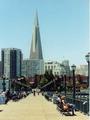
Welcome to San Franciscoby cvhs99Comment: Nice composition. I like the way the eye is led around the picture. You have two basic light levels in this picture however which would have been hard to manage within the rules of this challange. You couldn't have lightened the background buildings much without blowing them out, but the darker colors of the brick building, trees, and lamp posts merge and the effect is to lessen the impact. You might have been able to open up the exposure a stop though, which might have pulled the line of lamp posts visually out from the trees. |
| 06/26/2002 04:48:00 PM |
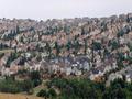
Too Close For Comfortby rkymtndreamComment: Did you compress this photo's horiziontal resolution this way purposly? It enhances the effect you're trying to achieve. |
| 06/25/2002 11:45:00 PM |
|
| 06/25/2002 09:12:00 PM |
|
Home -
Challenges -
Community -
League -
Photos -
Cameras -
Lenses -
Learn -
Help -
Terms of Use -
Privacy -
Top ^
DPChallenge, and website content and design, Copyright © 2001-2026 Challenging Technologies, LLC.
All digital photo copyrights belong to the photographers and may not be used without permission.
Current Server Time: 06/11/2026 02:20:48 PM EDT.