| Image |
Comment |
| 01/28/2005 09:19:48 AM |
Primary Colorsby sparklyComment: You have a great idea here. It's the attention to detail that distract me. If the yellow crayon had a point like the others, and if the labels were all facing the same direction, it would have been a much stronger shot for me. 7 |
 Photographer found comment helpful. Photographer found comment helpful. |
| 01/28/2005 09:15:45 AM |
All for one and one for allby RgarciaComment: Good shot. I think I would have gone for perfect symetry here though because it looks a little unbalanced with the extra dark area on the right. |
| Photographer found comment helpful. |
| 01/28/2005 09:02:28 AM |
Triple Threatby KDOComment: It looks like you missed a little with your desat - top of ball on left |
| Photographer found comment helpful. |
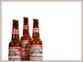
| 01/28/2005 08:51:00 AM |
Kingsby ArtanComment: I'm curious as to why you would have cut thr bottoms of the bottles off? |
| Photographer found comment helpful. |
| 01/28/2005 08:48:59 AM |
|
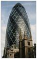
| 01/28/2005 12:21:27 AM |
Towersby ManicComment: Honestly, the first thing I noticed when the picture opened was the bright border. I guess that means it's a distraction from an otherwise nice image. |
| 01/28/2005 12:18:14 AM |
Early and last silver dollars.by cathysappComment: The juxtaposition is great! I think it would have been much better on a different surface than the hand. The skin color and textures are very distracting. |
| 01/28/2005 12:15:15 AM |
Light Sources: Old and Newby orussellComment: I don't see old and new here, sorry. What I see is differnt light sources. What you've got is good, I like the wisps of smoke on the right side. I just don't think this is particularly strong to the challenge. 5 |
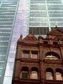
| 01/28/2005 12:13:00 AM |
Old and Newby KellsFotosComment: The image is too small to properly judge. From what I do see, the crop looks awkward and the distorted perspective is distracting. |
| 01/28/2005 12:10:29 AM |
|
| Photographer found comment helpful. |
Home -
Challenges -
Community -
League -
Photos -
Cameras -
Lenses -
Learn -
Help -
Terms of Use -
Privacy -
Top ^
DPChallenge, and website content and design, Copyright © 2001-2026 Challenging Technologies, LLC.
All digital photo copyrights belong to the photographers and may not be used without permission.
Current Server Time: 07/24/2026 12:50:44 PM EDT.