| Image |
Comment |
| 11/03/2004 11:38:07 PM |
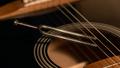
Tune me upby GautiComment: I like this composition except (and maybe it's the anal ret. in me) it bothers me that the tuning fork is in such an unnatural place. |
 Photographer found comment helpful. Photographer found comment helpful. |
| 11/03/2004 12:25:01 AM |
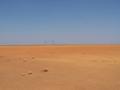
The end of the Worldby kghoshalComment: Your title would be more fitting if the mechanical parts were not in view. I think this would have benefited from the rule of thirds - the horizon line should not be in the center of the photo. |
| Photographer found comment helpful. |
| 11/03/2004 12:23:08 AM |
|
| 11/03/2004 12:21:36 AM |
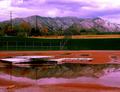
Track Reflectionby twentyfivesComment: I think this looks a little over processed. All the junk in the picture doesn't do it any favors either. |
| Photographer found comment helpful. |
| 11/03/2004 12:11:03 AM |
|
| 11/01/2004 01:10:05 PM |
|
| Photographer found comment helpful. |
| 11/01/2004 01:08:41 PM |
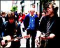
giving it allby aznymComment: A little contrasty - maybe that was intentional. Still represents the challenge very well. |
| Photographer found comment helpful. |
| 10/29/2004 01:31:04 PM |
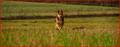
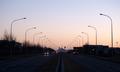
To the mountainby jonrComment: I really like the composition of this photograph. They way the light poles on either side lead the eye to the mountain in the distance is very good. I also like the symetry of the stop lights. My only nit is that the image is a little flat. 8 |
| Photographer found comment helpful. |
| 10/29/2004 08:18:26 AM |
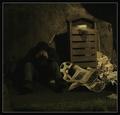
"Agony of cold"by BoltiComment: Really nice effort. The exposure is moody and the elements are all good. The nits that I have are that it all looks a little too contrived. The newspaper is unwrinkled and the person that is sleeping under them probably wouldn't still be holding the beverage. I think if these people were truely sleeping on the streets, the roll of plastic would used either as a drop cloth or a covering. I know this sounds really negative but I don't mean it to be that way. |
| Photographer found comment helpful. |
| 10/29/2004 03:03:21 AM |
ready to cook, but what?by shawon13Comment: Good example that fits the challenge. I think the compositon could be a little stronger for to have more impact - maybe from a less straight-on angle to get more of a feeling of "place"? maybe a little more contrast to pop the subject? I don't know but it just needs something to elevate it to great from good. 6 |
| Photographer found comment helpful. |
Home -
Challenges -
Community -
League -
Photos -
Cameras -
Lenses -
Learn -
Help -
Terms of Use -
Privacy -
Top ^
DPChallenge, and website content and design, Copyright © 2001-2026 Challenging Technologies, LLC.
All digital photo copyrights belong to the photographers and may not be used without permission.
Current Server Time: 07/23/2026 03:10:05 PM EDT.