| Image |
Comment |
| 07/29/2002 02:30:00 PM |
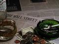
Wall Street Stressby psychephylaxComment: Pretty nice. possible improvements...a little more light...maybe the glass tipped over with vodka dribbling out to indicate you stumbled away in disgust...a few more butts. I get the all your money's on the market thing and I love the play of lights on the loose change...but that also shows that you have some cash. so, maybe the money could have stayed out. 7 Lisa |
 Photographer found comment helpful. Photographer found comment helpful. |
| 07/29/2002 02:31:00 PM |
|
| 07/29/2002 02:36:00 PM |
Silent Majorityby Gene L.Comment: I really like this for the challenge...photogragh clearly communicates it's message with viewer!! I like how the guy looks almost like chrome. How'd you do that? 10 Lisa |
| 07/29/2002 02:39:00 PM |
|
| 07/29/2002 02:44:00 PM |
|
| 07/29/2002 03:48:00 PM |
The Escapeby AmphianComment: Easily one of my favorites. I love the b&w, the composition, the humor, the message. 9 Lisa |
| 07/29/2002 02:38:00 PM |
Wall Street Avalancheby amnonComment: nice abstract interpretation! I'd like to see cleaner whites (work on the lighting), but I like this. 8 Lisa |
| 07/31/2002 07:14:00 PM |
Corporations Makin' a Killingby rdesaiComment: blood money...nice. I like the fitting look in George's eye...can't put it into words but it seems to go well with being nailed. Could have used a little more focus on the nail (I played with something similar this week and had a similar annoying problem with focus on the 'nail.' I think the texture on the black fabric detracts a little too. 6 |
| 07/29/2002 03:17:00 PM |
Retirement Nest Eggby camelotnorthComment: Very original idea! I wish there were some way for you to imply the 401k thing in the photo though...love it all the same. 9 Lisa |
| 07/31/2002 07:55:00 PM |
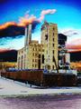
Corporate Leftoversby gigageekComment: i really like the wacky colors and textures here...looks toxic! I even like the slight crookedness of the angle/leaning building. 8 LIsa |
Home -
Challenges -
Community -
League -
Photos -
Cameras -
Lenses -
Learn -
Help -
Terms of Use -
Privacy -
Top ^
DPChallenge, and website content and design, Copyright © 2001-2026 Challenging Technologies, LLC.
All digital photo copyrights belong to the photographers and may not be used without permission.
Current Server Time: 07/17/2026 11:58:04 PM EDT.