|
|
|
Showing 2781 - 2790 of ~3951 |
| Image |
Comment |
| 07/18/2004 12:48:26 PM | Flea Marketby dclarkeComment: Nice composition. You might try adjusting the hot spot on the pumpkin in the foreground, it's a bit bright. :o) |  Photographer found comment helpful. Photographer found comment helpful. |
| 07/18/2004 01:28:16 AM | | | Photographer found comment helpful. |
| 07/18/2004 01:27:33 AM | | | Photographer found comment helpful. |
| 07/17/2004 08:08:49 PM | | | Photographer found comment helpful. |
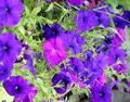
| 07/15/2004 06:39:35 PM | Field of Purpleby MyD2Comment: Howdy from the Critique Club!
Flowers are always beautiful, yet somewhat controversial subjects around DPC. Some love them, some hate them. I would imagine that initially, your flower photo suffered from the "not another flower shot" voters. That not withstanding, let's look at it from the technical perspsective.
Color: the colors in your image seem quite altered...that is, the purples do seem very saturated in comparison with the greens. This could be attributed to excessive post production or from harsh lighting. Perhaps reshooting in early morning or late afternoon/early evening light would give you a much better and softer light, allowing the true and beautiful colors to shine through. If it was due to processing, backing off the saturation of the blue, red, or magenta channels might help, or a boost of the greens/yellows. At the top in the center, there is a more reddish purple bloom that is distracting colorwise, along with some longer green grass or stems. Cropping tighter in would eliminate that distraction.
Focus: There seems to be a soft focus all the way around the image, with just a little bit rendered more sharply in the center. This, coupled with the lack of a definite, clear, and precise focal point (as in too much for the eyes to take in at once) makes it difficult to appreciate the true beauty of these flowers. The blooms along the left edge that are out of focus and cut off on their edges also stop the eyes. Cropping them out entirely, or recropping with their blooms in entirely, could help.
Composition: Like I said above, the lack of a specific focal point can create some problems...you might reshoot with just fewer blooms at a time, or even one or two. Lead the eyes into a particular place, instead of creating a field of vision that the eye wanders over entirely with no specific place to land.
Challenge: This is definitely a purple image, meeting the challenge in that respect. However, the voters probably found that the flower as a subject was not original enough for their tastes. The technical aspects I've mentioned above also are taken into account during challenge voting, leading the voters to the lower end of the scale.
All in all, the flowers as a subject are nice, but with some adjustments, this shot could be more powerful and quite lovely. If you have any questions, please feel free to contact me through PM...I'm learning, too! :o)
Laurie/CC
|
| 07/15/2004 03:07:49 PM | Ornament on Potteryby BikeRacerComment: Howdy from the Critique Club!
I was surpised to get a photo that upon which I had previously left a comment...so I will start from there.
"I think I would like it more without the pottery...just the purples together would be pretty. :o)" I still believe that. I think that in this shot, the grey of the pottery overpowers the subtle purples of the yoga mat and the ornament itself. The splash of red on the tassel is also competing for attention from my eyes, drawing it away from the purple as well.
The tilted horizon, which is effective in some instances, seems to throw the image off balance. The ornament is sitting on a flat plane, but it appears just a bit awkward with the unlevel background "horizon." There is a bit of light in the top right that is going in a completely different angle, which adds to the imbalance, IMHO. Perhaps a more solid, subtle background would allow the beautiful purples and golds of the ornament to really show off.
The ornament itself, with its rich jewel tones, has a glossy surface that has created a hot spot reflection. Since I'm no lighting guru, I would only suggest less direct light or backing the light source away a tad. I do like the light and the patterns on the yoga mat. That's a creative and beautiful choice. The focus is good on the ornament and part of the tassel, but the shallow DOF, I'm guessing, left the red tassel end out of focus, which makes it more of a distraction.
Compositionally, I would suggest a tighter crop on the right side, creating less of a centered look.
Overall, it's a nice picture with several positive attributes, some upone which improvements could be made, and if you have any questions, please feel free to PM me...I'm learning too!! :o)
Laurie/CC
| | Photographer found comment helpful. |
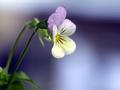
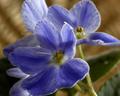
| 07/15/2004 01:47:30 PM | Purple Auraby channeledComment: Howdy from the Critique Club!
This a very nicely composed image. I like the use of negative space, the framing of the flower, and the angle from which it is photographed.
The focus on the petals is just a tad soft, but soft in a way that doesn't negatively affect the image quality. I am especially fond of the lighting of the flower itself, which is soft and adds a slight glow to the yellows in the bloom. The DOF you have used works well, leaving just enough blur on the stem and leaves, but not creating a blur that causes you to wonder, "What is that green stuff?" I might have been inclined to use just the one stem with the bloom, and either moving the other stem or editing it out in post, but it's not too distracting as it is.
The background, with the subtle shades of purple, is soothing, yet the lighter areas are a bit distracting, slightly overwhelming the soothing nature of the rest of the tones. That isn't to say that the background is bad...it's not. It could be even more dramatic with less intensity in the lighter shades, IMHO.
I would imagine that the voters during the challenge found this image to be less "purple" and more "flower." The purple is very subtle, and many voters probably wanted to "be hit over the head" with purple rather than appreciate the finer details of the color. In addition, flower shots have gotten a bad rap lately, but for the life of me I don't know why. It's not easy to take a beautiful flower picture that works as well as yours. You probably suffered from low votes from those that dislike flower shots of any kind in any challenge, which is a shame.
This is a nice image with many positive attributes and some which could be made even better with minor adjustments. If you have any questions, please feel free to PM me, as I am learning all the time as well! :o)
Laurie/CC |
| 07/15/2004 12:43:44 PM | Sweeter than the Rosesby qnjtComment: Howdy from the Critique Club!
The flowers you have chosen make for a lovely subject. I think that you have captured their delicate and fragrant nature well.
Your photo has great depth, giving the shot an almost 3-D appearance. I would like to see the edges of the petals within the frame...as it is, the tips being cropped away stops my eye, leaving me wanting for more in the frame.
The focus and DOF are nice in this image...the sharp edges and delicate softness of the petals are both captured well, along with the fuzzy stems. The blurring in the background keeps the focus on the blooms.
The background seems almost split in half horizontally...the greenery on the lower half and the beige color on the top (which almost has a radial blur to it that is quite interesting). I would prefer to see a more constistent background, either all foliage or all beige, but that is my taste. It isn't terribly distracting and seems to work here, but I wonder how it might be even better with changes in the background.
The lighting is beautiful along the right two-thirds of the picture, but in the lower left corner, it darkens...and coupled with the dark background in that area, it becomes just a bit too dark.
The color of the petals, on my monitor, appears to be more of a blue shade than purple...which might have posed problems for you during the Purple challenge. I believe that voters were looking for the more traditional, jewel-toned purple rather than the many, and quite lovely, variants seen in the challenge.
I like the compostion of the three flowers...perhaps a bit centered, but sometimes centered composition works well, and I think this is one of those cases. You might try different crops from the original and experiment with centered and off-centered placement of the flowers, just to see if you come up with a visually pleasing arrangement that works as well as this one. I love to experiment myself, and am constantly learning different ways to present the same photo!
All that said, it's a lovely image with many positive attributes and places upon which to improve. If you have any questions, please feel free to PM me...I'm learning too!!! :o)
Laurie/CC
| | Photographer found comment helpful. |
| 07/15/2004 11:04:39 AM | |
| 07/15/2004 11:01:44 AM | Dark Flowersby eostylesComment: Beautiful lighting...the mood of mystery and intrigue is very interesting. I would like to see the rest of the petals that were cut off on the right. I actually like the grain and the noise. | | Photographer found comment helpful. |
|
Showing 2781 - 2790 of ~3951 |
Home -
Challenges -
Community -
League -
Photos -
Cameras -
Lenses -
Learn -
Help -
Terms of Use -
Privacy -
Top ^
DPChallenge, and website content and design, Copyright © 2001-2026 Challenging Technologies, LLC.
All digital photo copyrights belong to the photographers and may not be used without permission.
Current Server Time: 06/20/2026 01:34:38 PM EDT.
|