|
|
|
Showing 2331 - 2340 of ~3951 |
| Image |
Comment |
| 01/15/2005 07:04:29 PM | Vby mocabelaComment: This is lovely. I really like the light and the detail in the water drops. Wonderful work! :o) |  Photographer found comment helpful. Photographer found comment helpful. |
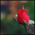
| 01/15/2005 07:04:00 PM | the roseby mocabelaComment: Absolutely gorgeous... I wish the greenery wasn't cut off along the right edge but it's still so nice!!! :o) | | Photographer found comment helpful. |
| 01/15/2005 07:03:10 PM | romance in pinkby mocabelaComment: I love this one, I think it's my favorite of the three. Pink is my favorite color, and the light, texture, and detail on this one is exquisite. I kind of wish to see more rose on the right lower portion of the frame, and less of the pink negative space on the top left corner, but it's still balanced and beautiful. The whitish area on the lower left is a tiny bit distracting. Overall, however, it's gorgeous. :o) | | Photographer found comment helpful. |
| 01/09/2005 04:38:55 PM | Rockensteinby photomayhemComment: Howdy from the Critique Club! :o)
You placed 32nd in the Hidden Faces challenge with this image, so there isn't a whole lot for me to say that you haven't already read from other commenters. I'll briefly touch on four aspects with my random thoughts...composition, technical details, relationship to challenge, and aesthetics.
1. Composition: I love the arrangement of the rocks. Perhaps the focal point (Mr. Rockenstein) could have been placed a bit off center, as a centered composition is not as pleasing to most DPC voter's eyes and is rather static.
2. Technical details: Your focus is sharp, the exposure is good, perhaps a little bit of dodging or curves adjustment could bring up some of the darker parts of the shot. I might even suggest a bit more sharpening to bring up some of the textures of the rocks. Aside from those nitpicks, it is visually interesting and appears to be shot well.
3. Relationship to challenge: You hit this one head-on (no pun intended). Excellent find and perfect for this challenge.
4. Aesthetics: It is a visually interesting and pleasing subject for the challenge. It is not a "cookie cutter" shot and that alone sets it apart from many others. It could have been stronger with more lighting adjustments, to emphasise his Frankenstein-ness or make it more macabre. However, that aside, it isn't a bad shot on the old eyes! :o)
Overall, it's a very strong image with good points and points upon which improvements could be made. Best of luck in future challenges, and if you have any questions, please feel free to PM me! :o)
Laurie
Critique Club | | Photographer found comment helpful. |
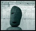
| 01/09/2005 05:41:57 AM | Hi my name is Stone Face, what is yours?by JohannesFrankComment: Howdy from the Critique Club! :o)
You placed quite nicely in the Hidden Faces challenge with this image, so there isn't a whole lot for me to say that you haven't already read from other commenters. I'll briefly touch on four aspects with my random thoughts...composition, technical details, relationship to challenge, and aesthetics.
1. Composition: I quite like the off-center composition. Many find a centered composition to be too static, and I am one of those people. I do have one little nitpick, in that I would have preferred to see it composed more on the right side than the left, as that "eye" is missing and I would like more lead room on the left where his good "eye" might be seeing or something, but that is just me. The lines in the background are not completely on the horizontal, so I might suggest a slight rotation and cropping, or the use of one of the transform tools in Photoshop (skew, perspective, etc) to pull it to a level horizon.
2. Technical details: Your focus is sharp, your processing technique is nice, exposure is good (a slight glare in tiny spots on the background...appears that the paint is rather reflective or something), and lighting is nice. Some commented that more light would be more effective, which is true. Or perhaps some dodging across the little guy. Some way to highlight him against the background.
3. Relationship to challenge: You hit this one head-on (no pun intended). Excellent find and perfect for this challenge.
4. Aesthetics: It is a visually interesting and pleasing subject for the challenge. Some might be a bit put off by the lime green color, but it seems to work well. I might have gone with a cooler grey, sepia, or blue to emphasize the stone, but that's no biggie.
Overall, it's a very strong image with good points and points upon which improvements could be made. Best of luck in future challenges, and if you have any questions, please feel free to PM me! :o)
Laurie
Critique Club | | Photographer found comment helpful. |
| 01/09/2005 05:19:33 AM | angstby AleciaComment: This is awesome, alecia! Very emotive and extremely cool processing. :o) | | Photographer found comment helpful. |
| 01/09/2005 05:15:59 AM | I'm watching youby hogster558Comment: Howdy from the Critique Club! :o)
I am sure that by the other comments you received for this entry you know some of the things I am about to point out, so I will try to be brief in my commenting so as not to bore you to tears. The four areas that I will address are composition, technical details, relationship to challenge, and aesthetics.
1. Composition: I think that your have a very strong facial image in your shot, however, it could have been presented in a composition that would have been stronger and could have accentuated your find in a better way. Your shot is very centered, which many find displeasing or rather uneventful. The "face" itself is dead center of the frame. I think a portrait composition, with more "hair" on top and less sky on the sides would be more visually pleasing and interesting.
2. Technical Details: Your focus is fairly sharp (a little soft on the "hair"), but it appears that you may have taken this in fairly harsh lighting conditions judging by the shadow on the "face" and the contrast between the tree and the sky. Perhaps shooting at a time when light is softer (early morning, late afternoon) or using a fill flash so as not to lose important details in the "face" could help. The color of the sky, as some noted, is a bit too blue, bordering on purple, which could be a monitor calibration issue or it could be an editing issue. Either way, it's something to check into as DPC voters are notorious for their attention to details such as this. The size of your image is rather small...I strongly suggest using the entire 640 pixel limit on the longest size of your entry, as well as the full 150KB file size you are allowed so as not to lose detail.
3. Relationship to challenge: This is your strong point for your shot, as it meets the challenge head-on (no pun intended). Great eye to be able to find and capture such a shot.
4. Aesthetics: Your shot is nice to look at, but doesn't have as much of a visually-pleasing impact as it could have IMHO. Looking at your final score, I believe it is one of those shots that voters look at for the cursory 2 to 3 seconds, rate 4 or 5, and move on without a second look or longer examination. This is where the "wow" factor comes into play. Look for something to set your shot apart from all the others. Interesting lighting, point of view, focal point, or subject matter that grabs a viewer's attention for longer than 2 seconds will give you more points.
Overall, your shot has strong points and points upon which can be improved with some slight changes and by taking advantage of some opportunities. Best of luck to you in future challenges. If you have any questions, feel free to PM me!
Laurie :o)
Critique Club |
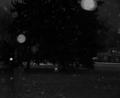
| 01/05/2005 04:29:27 PM | Snowfallby fotodudeComment: The top half of the pic is VERY dark on this monitor except for the flakes. The bottom half shows fairly good detail in the house, the grass, and the low branches of the tree. It is overall dark though. I wonder if it is a calibration issue. Good composition and I can see what you were after. :o) | | Photographer found comment helpful. |
| 01/05/2005 09:59:20 AM | | | Photographer found comment helpful. |
| 01/05/2005 12:00:56 AM | | | Photographer found comment helpful. |
|
Showing 2331 - 2340 of ~3951 |
Home -
Challenges -
Community -
League -
Photos -
Cameras -
Lenses -
Learn -
Help -
Terms of Use -
Privacy -
Top ^
DPChallenge, and website content and design, Copyright © 2001-2026 Challenging Technologies, LLC.
All digital photo copyrights belong to the photographers and may not be used without permission.
Current Server Time: 06/21/2026 11:32:16 PM EDT.
|