| Image |
Comment |
| 10/27/2006 09:14:26 PM |
Glory by ShannonLeeComment: I like this a lot but the jacket hanging on the fence and the garden hose in the background are distracting in this particular composition. I'd like to see a little more breathing room around the outsides of the frame, particularly to the right and along the top. |
 Photographer found comment helpful. Photographer found comment helpful. |
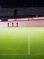
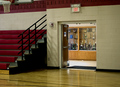
| 10/27/2006 09:13:35 PM |
Empty Homeby cladironbeardComment: Meets challenge well. The bucket in the center distracts the eyes and pulls all the attention to it. The benches on the right, and the rail of the stairs going down to the field on the right, also are distractions that interrupt the horizontal flow the repeating patterns had created. |
| Photographer found comment helpful. |
| 10/27/2006 09:12:23 PM |
|
| Photographer found comment helpful. |
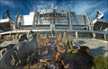
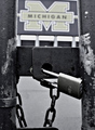
| 10/27/2006 09:11:33 PM |
Echoes of Gloryby BeeCeeComment: I can tell the field is lined up properly but the rise of the background makes it feel "off" or odd in some way. I'd crop out a lot of the top area above the fence as well, since it doesn't add to the composition. |
| Photographer found comment helpful. |
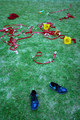
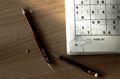
| 10/27/2006 09:10:01 PM |
Blue Shoesby loveComment: It took more than a few moments to figure out what all the burgundy things were in the back of the image. Voters typically only give images a cursory glance of a few seconds, and if it takes longer than that to "get" an image, you stand a good chance of receiving a bad score. The concept of this shot is good, but its execution is lacking. The image has a blue cast to it, making the colors a bit unrealistic on my monitor. The composition of the image is very scattered and lacking a focal point when you take away the title. I think that changing the perspective, i.e. squatting down instead of taking the shot from eye level, might have increased the power of the image. Good luck in the challenge. |
| Photographer found comment helpful. |
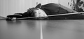
| 10/27/2006 09:09:59 PM |
The aftermathby bimbleComment: LOL this is funny. I wonder if it would be stronger if the table were turned counter clockwise a few degrees so that the entire background were the vertical blinds, losing the tree on the right, which is very distracting. I'd also suggest losing some foreground and adding more on top, because of the neat lines and light from those blinds. Nice black and white; could use some more contrast IMHO. Good luck in the challenge. |
| Photographer found comment helpful. |
| 10/27/2006 09:09:56 PM |
Love It, Hate Itby foxtrotComment: I think a bit of tilt to the camera would increase the dynamics of this shot immensely. I also think that a black and white conversion might really bring out some of the cool textures in the shot. Good concept. |
| Photographer found comment helpful. |
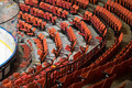
| 10/27/2006 09:09:53 PM |
Corner Boardsby lkn4truthComment: I like the repetition in this shot; nice color and sharpness as well. The white ice is a bit distracting, calling attention away from the seats. |
| Photographer found comment helpful. |
| 10/27/2006 09:09:24 PM |
Come back next weekendby sandeep_tataComment: Good idea for the challenge. Composition feels a bit cramped; would crop out the tiny bit of whatever that is along the bottom edge. |
| Photographer found comment helpful. |
| 10/27/2006 09:08:43 PM |
|
Home -
Challenges -
Community -
League -
Photos -
Cameras -
Lenses -
Learn -
Help -
Terms of Use -
Privacy -
Top ^
DPChallenge, and website content and design, Copyright © 2001-2026 Challenging Technologies, LLC.
All digital photo copyrights belong to the photographers and may not be used without permission.
Current Server Time: 06/20/2026 02:16:24 AM EDT.