| Image |
Comment |
| 11/02/2006 06:14:36 PM |
Sunrise Stormby p3wizComment: Lovely scene and good composition. The dark clouds in the corners and the vignetting is a bit strong, but still quite dramatic. |
 Photographer found comment helpful. Photographer found comment helpful. |
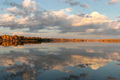
| 11/02/2006 06:13:47 PM |
Ashapmushuanby esaintpiComment: What a lovely reflection. The image almost seems surreal due to the symmetry from top to bottom. The issue I'd like to comment upon is the fact that your horizon line really chops the image into two halves, which is not very dynamic. In an image like this, I'd rather see less sky and more reflection, or less reflection and more sky, but I can definitely see where you were going with this because of the symmetrical composition. Good luck in the challenge. |
| Photographer found comment helpful. |
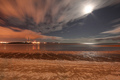
| 11/02/2006 06:12:21 PM |
Moonlight Strandby dsherwinComment: Lovely colors and movement in the clouds. I do want to comment on the fact that your horizon line serves to divide the image into halves, which is not quite as dramatic or dynamic as thirds might be...however, the different areas of shore out to the water serve to give the image a bit more depth and dimension. Nicely exposed and colored. Good luck in the challenge! :) |
| Photographer found comment helpful. |
| 11/02/2006 06:10:23 PM |
|
| Photographer found comment helpful. |
| 11/01/2006 08:27:10 PM |
Harvestby TechoComment: One of my favorites so far...great still life; beautiful light and color. :O) |
| Photographer found comment helpful. |
| 11/01/2006 08:26:52 PM |
Paris Landing Golf Courseby RockBruiseComment: The horizon seems tilted down to the right a bit. Great view and scene; could use some contrast and a tiny bit of saturation. :) |
| Photographer found comment helpful. |
| 11/01/2006 08:26:21 PM |
|
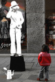
| 11/01/2006 08:26:04 PM |
Miseryby GinaRothfelsComment: Image feels cramped at the top and bottom, like it needs more breathing room. I'd also crop from the right to lose the one board that runs vertically...the horizontal ones behind her lead you through the image and that one seems to create a stopping point that is uncomfortable. Processing is a bit over the top; I can't make out her features as clearly as I would like. |
| Photographer found comment helpful. |
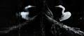
| 11/01/2006 08:24:41 PM |
Distorted Symmetryby zaflaboutComment: How interesting to rotate the image...makes one pause and ponder longer. Great exposure on the whites; love the contrast. |
| Photographer found comment helpful. |
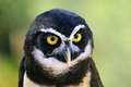
| 11/01/2006 08:23:29 PM |
Speckled Owlby pmichaudComment: Great clarity...would suggest a crop on the left to get rid of more of the dark area, and some more sharpening on the eyes/beak area. Lovely! :) |
| Photographer found comment helpful. |
Home -
Challenges -
Community -
League -
Photos -
Cameras -
Lenses -
Learn -
Help -
Terms of Use -
Privacy -
Top ^
DPChallenge, and website content and design, Copyright © 2001-2026 Challenging Technologies, LLC.
All digital photo copyrights belong to the photographers and may not be used without permission.
Current Server Time: 06/20/2026 03:16:18 AM EDT.