| Image |
Comment |
| 06/20/2006 07:53:31 PM |
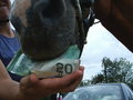
Nothing's too good for my horse!by snafflesComment: Okay, so I get the concept. But it could be better executed in my opinion. Car in the background distracts from the message. Clip on the money is incongruous. Brights are too bright, and darks lose some detail and color saturation that could have been interesting. Put the girl's face in the frame with more of the horse's head and convince me of a loving relationship set in a pastoral setting ... and I'm almost there with you. |
 Photographer found comment helpful. Photographer found comment helpful. |
| 06/20/2006 07:48:09 PM |
Peacock in our houseby UAE_GuyComment: I have a number of issues with this photo. Firstly, it seems over exposed. With less light the rich color of the feathers would have shown better. The background doesn't detract from the bird but it doesn't contribute to the photo either. And finally the photo is too small. If you were to reshoot to correct these things, I think it would score in the 5-6 range. Lastly, it doesn't really call out to me saying "Indulgent." Maybe there's a cultural thing going on so it could be my issue. |
| 06/20/2006 07:43:33 PM |
When indulgence was just a gameby seamusjoeComment: I guess this said indulgent to you but not to me. I think it would have been better with less light ... seems over exposed. I am unsure of the story you're trying to tell me with the photo. Guess this'll seem negative but I'm not resonating with this one. Sorry. |
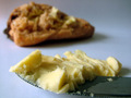
| 06/20/2006 07:40:36 PM |
bread and butterby shaundpComment: Competant photo. Well lit. Like the DOF. Composition's okay. And maybe it says indulgent to you but IMO dnmc. |
| 06/20/2006 07:39:01 PM |
Cigars, Booze and Finger Puppetsby Jason_CrossComment: I'm searching to find something positive, here. It is in focus. The lighting is good, way good enough to read the lables and to give definition to the puppet (?) through light and shadow. However I wish you had applied your talent to a subject that appealed to me more. |
| Photographer found comment helpful. |
| 06/20/2006 07:34:53 PM |
The Triple by DefyTimeComment: Meets the challenge in a Jenny Craig sort of way. Vibrant colors. Good contrast. But not a subject that appeals to me. |
| 06/20/2006 07:32:59 PM |
Strawberry Indulgenceby Friskycat3Comment: In my opinion, too much and too harsh a light. It looks like it was lit by the flash which was too close to the subject. Maybe try natural light or a separate light source off to the side and at a lower angle. |
| Photographer found comment helpful. |
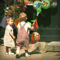
| 06/20/2006 12:02:19 AM |
OCHAby ariantoComment: Lovely girl. Well captured. Composition is super. Colors and saturation are very very good. Little heavy on noise reduction for my taste. Hair and hand nicely frame the face. Hope you don't get any dnmc comments. |
| 06/19/2006 11:48:48 PM |
|
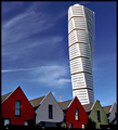
| 06/19/2006 11:46:45 PM |
Shapes and colorsby puzzledComment: I like the photo a lot. Nice saturated contrasting colors make it a dynamic photo. Interesting subject. interesting context with the houses in front. I suppose the sky frames the building but it's a pretty loose sort of framing. |
| Photographer found comment helpful. |
Home -
Challenges -
Community -
League -
Photos -
Cameras -
Lenses -
Learn -
Help -
Terms of Use -
Privacy -
Top ^
DPChallenge, and website content and design, Copyright © 2001-2026 Challenging Technologies, LLC.
All digital photo copyrights belong to the photographers and may not be used without permission.
Current Server Time: 06/23/2026 12:04:39 AM EDT.