| Image |
Comment |
| 09/20/2004 08:55:00 PM |
8by TranquilComment: Hehe...yea...this was due to WIND! |
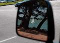
| 09/17/2004 02:40:56 PM |
Sailingby jazzmanmgtComment: A little less of the road would have strengthened this image tremendously. |
 Photographer found comment helpful. Photographer found comment helpful. |
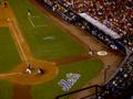
| 09/16/2004 09:15:31 AM |
Ready to batby trunkiComment: Let's Go Mets! Gotta Believe! These last few weeks have been upsetting though...Anyways I like the photo...if you qould have placed the circle on the bottom left intersection according to the ROT, it would have been stronger compositionally. Good shot from the mezzanine green it looks like. |
| Photographer found comment helpful. |
| 09/13/2004 06:56:29 AM |
|
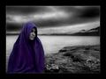
| 09/08/2004 09:38:14 PM |
Silence IIby heidaComment: I sort of disagree with Thaymer. The original has a much "moodier" mood to it as this is much brighter and soft. The purples seem a tad over-saturated for my taste in this one, which also detracts from the meaning I got from your original work. The texture of the rocks on the close right also seems more natural and balanced than in this one. Just my two cents. Either way---a stunning photo Heida! |
| Photographer found comment helpful. |
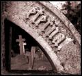
| 09/08/2004 05:36:08 PM |
Eternal Resting Placeby KonadorComment: "I wouldn't have felt comportable taking my bulky DSLR into a graveyard and photographing peoples graves."
Why not, I do it all the time! At least the deceased can't ask you "why?"
Great shot, Ben. |
| Photographer found comment helpful. |
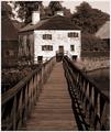
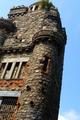
| 09/08/2004 11:52:14 AM |
Rapunzel, Rapunzel let down your hairby ladpupmoeComment: Greetings from the Critique Club
Great subject matter here. I like the interesting tone of the orange and the yellows scattered on the stonework. You showed this very nicely.
A couple of criticisms...I understand the way you tilted the camera to achieve an effect of exagerrated heigh but this does not work here for two reasons. One, there are no verticals that are parallel to the frame. Also, the top of the building is just cut-off to that there is no breathing room. Try to include not just the whole building but also some part of the sky above it to balance out the photo. My last bit of criticism is that it seems to focus is off.
Good photo, nice attempt. Next time you get over there try again. Good luck!
If you have any questions, comments, or concerns, feel free to PM me. |
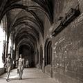
| 09/07/2004 08:51:22 PM |
Deux jeunes fillesby jjbeguinComment: Two young girls indeed! I like this photo very much. It has such a timeless look and is full of interesting aspects. The only problems that I have with it are the blown out highlights on the right and the slight tilt that is noticed by the far doorway. Otherwise, flawless! C'est beau! |
| Photographer found comment helpful. |
| 09/07/2004 08:41:55 PM |
|
| 09/06/2004 08:55:26 PM |
Destination Unknownby jmsetzlerComment: I think that this is an interesting composition, but it does not seem to be a photo that I would find myself seeing in a magazine. Besides that, the light coming from the top of the stairs looks a little bit blown out. |
Home -
Challenges -
Community -
League -
Photos -
Cameras -
Lenses -
Learn -
Help -
Terms of Use -
Privacy -
Top ^
DPChallenge, and website content and design, Copyright © 2001-2026 Challenging Technologies, LLC.
All digital photo copyrights belong to the photographers and may not be used without permission.
Current Server Time: 07/19/2026 10:03:38 AM EDT.