| Image |
Comment |
| 11/17/2002 07:40:00 PM |
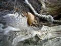
noneby dragoscapotaComment: It might have been more effective with a little less of the unfocused area in the lower left. I like the detail on the rope, but the "fade-in" might be worked on. |
| 11/17/2002 08:37:00 PM |
|
| 11/14/2002 12:34:00 PM |
|
| 11/14/2002 12:22:00 PM |
Blue Plumeby rascalComment: Striking composition and color. The "fuzzy" focus is effective here, however I would suspect that some will not like it. |
| 11/14/2002 01:04:00 PM |
Close To My Heartby BigSmilesComment: Background seems distracting. There are almost two pictures here---the locket and chain being one and the "blobs" being another. It might have been an idea to separate the two---each could stand on its own but they don't really seem to work together. Nice clarity. |
| 11/14/2002 01:25:00 PM |
Fly Away Homeby KazComment: Nice composition. Upper right keys seem too bright and distract from the main subject. |
| 11/17/2002 08:08:00 PM |
Redby JeanComment: The subject is nice, but the background seems too distracting. Composition is good, focus is good, but the background. . . Maybe it's just me. |
| 11/17/2002 08:11:00 PM |
Chains of Steelby byetkoComment: Nice, but there seems to be too much "washed out" glare in upper part. Otherwise, I like it. |
| 10/21/2002 05:29:00 PM |
Hare Force (Chess)by MagsCoyoteComment: The lighting is good and the selective focus, however the blurred part of the image at the front and right seem distracting. It might have been more effectively framed with less (if any) of the green at the right. |
| 10/21/2002 02:49:00 AM |
|
Home -
Challenges -
Community -
League -
Photos -
Cameras -
Lenses -
Learn -
Help -
Terms of Use -
Privacy -
Top ^
DPChallenge, and website content and design, Copyright © 2001-2026 Challenging Technologies, LLC.
All digital photo copyrights belong to the photographers and may not be used without permission.
Current Server Time: 05/06/2026 12:46:47 AM EDT.