| Image |
Comment |
| 02/23/2006 07:06:22 PM |
|
 Photographer found comment helpful. Photographer found comment helpful. |
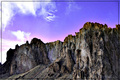
| 02/01/2006 04:33:23 PM |
Smith Rocksby Sunshine86Comment: Nice textures, but seems overprocessed. I usually don't comment on borders, but I feel this one distracts from the photo. |
| 01/19/2006 01:31:33 AM |
Tower of Sand Ballsby dnallyComment: Horizon not being level is distracting. Nice elements, but could be cropped closer on left to get rid of something and a little closer to right to remove person who is almost out of picture. |
| 01/19/2006 01:10:49 AM |
|
| Photographer found comment helpful. |
| 01/19/2006 01:09:00 AM |
Buddha of Compassionby shutterphunkComment: Nice idea, but, for me, there's too much out of focus in the foreground. It might have been more effective with less and still had the depth of field effect. |
| Photographer found comment helpful. |
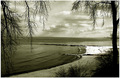
| 01/16/2006 06:55:08 PM |
Do you see what I see?by BillysSweetieComment: Like your idea here. Might be a little more effective with different crop taking out more of the figures to the right and emphasizing reflected image. You would only need to suggest the figures being reflected. Use the "rule of thirds" and only give 1/3 to the images to the right instead of 1/2 and see what that does. You might "play" with the contrast a little too. Just my opinion. |
| Photographer found comment helpful. |
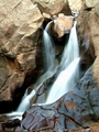
| 01/16/2006 06:42:17 PM |
Boulder Fallsby mystardreamComment: Neat, except part of falls seems "blown out". I like the composition and detail on everything else. |
| Photographer found comment helpful. |
| 01/16/2006 06:36:56 PM |
Cape Pondweedby wsteynComment: Seems like unfocused element in front distracts from part that is focused. If it had been closer to bottom of photo it would have been less of the dominating feature and would lead better into the focused part of the image. Different crop might help. |
| Photographer found comment helpful. |
| 01/16/2006 06:27:28 PM |
|
| 01/16/2006 06:26:14 PM |
|
| Photographer found comment helpful. |
Home -
Challenges -
Community -
League -
Photos -
Cameras -
Lenses -
Learn -
Help -
Terms of Use -
Privacy -
Top ^
DPChallenge, and website content and design, Copyright © 2001-2026 Challenging Technologies, LLC.
All digital photo copyrights belong to the photographers and may not be used without permission.
Current Server Time: 05/05/2026 08:44:16 AM EDT.