| Image |
Comment |
| 01/15/2006 10:28:48 PM |
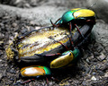
Insect Picnicby bobdaveantComment: god DAMN this makes me hungry, mmmmmmmmmm
are you sure you didn't mean to submit this to Recipes II? :P |
 Photographer found comment helpful. Photographer found comment helpful. |
| 01/15/2006 10:27:45 PM |
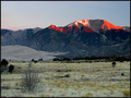
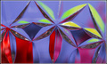
Sangre De Cristo ( Blood of Christ )by pitsamanComment: excellent choice for this challenge. the initial impact is very strong. after looking at it a bit more I find myself wishing that the reds weren't so heavily saturated; in some areas, they're almost flat color fields. Other than that, I really like this picture... it has a lot of depth and texture to it. the grasslands in the foreground hold a lot of interest, and the partial desaturation is very effective. |
| Photographer found comment helpful. |
| 01/15/2006 08:03:31 PM |
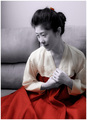
flowing red dressby snackwellsComment: the processing, especially the color treatment, is clearly sophisticated, and the skill of the artist shines through. still I find this image bottom-heavy - I don't think the hair clip is enough to balance out the field of red folds at the bottom. |
| Photographer found comment helpful. |
| 01/15/2006 08:01:36 PM |
|
| Photographer found comment helpful. |
| 01/15/2006 08:01:31 PM |
|
| 01/15/2006 08:00:43 PM |
|
| Photographer found comment helpful. |
| 01/15/2006 07:51:16 PM |
Sarah - Land downunder coloursby trobergeComment: I like the colors and the composition, and the girl is a charmer. I'm not sure how you achieved this, but to me the girl looks like a cardboard cutout. The ragged outline and angularity of her shirt, hair, and left hand make this look like it was shot on a completely different background and then cut out with the Lasso tool. There are things that I like about this picture, but the processing appears clumsy. |
| Photographer found comment helpful. |
| 01/15/2006 07:45:36 PM |
by SDWComment: interesting photo and technically well accomplished; the exposure, colors, and focus are excellent. I find the grey border a poor choice, though - it distracts from and clashes with the photo. |
| Photographer found comment helpful. |
| 01/14/2006 06:32:25 AM |
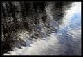
Trees in Waterby e301Comment: This is the first time I have seen this sort of reflective image executed with such technical excellence and then submitted to a challenge for which it is perfectly relevant. This particular style having been so tested, and found solidly mediocre by the jury of DPC voters, I suppose it's not worth trying on DPC again any time soon. Ah well, voters often completely overlook gems like this.
I am guessing that what threw at least some off is that this sort of picture, executed poorly, is the kind of photograph that everyone probably takes at one time or another. It's worth repeating what I said above: the execution here is near flawless, and I think that it would be easy to underestimate the difficulty of accomplishing what you have here.
I applaud you for your willingness to take the risk of presenting the voting public with something outside of the norm. I think this is as important as any other charge that a photographer might have. |
| Photographer found comment helpful. |
| 01/13/2006 10:57:29 PM |
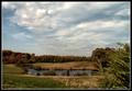
Bring the Picnic Basketby glad2badadComment: The color treatment in this image is very attractive - it's understated without being underdone or looking washed out. The elements of this picture hold together well; the lake is well placed, as is the tree in the lower right foreground.
I gave this a 6 during the challenge - and I would have given it higher marks if it were just a bit sharper. May I suggest another pass of USM at, say, 0.4 radius, 70%, 0 threshold? I'd really be interested in seeing this touched up just a bit.
edit- I just threw this into photoshop myself to see what'd happen if I applied my own suggestion. What I wound up with was duplicating the image layer, and using 0.4, 100%, 0 threshold, and then masking off the sky and the tree in the LL. The difference is subtle but IMO significant. Message edited by author 2006-01-13 23:00:33. |
| Photographer found comment helpful. |
Home -
Challenges -
Community -
League -
Photos -
Cameras -
Lenses -
Learn -
Help -
Terms of Use -
Privacy -
Top ^
DPChallenge, and website content and design, Copyright © 2001-2026 Challenging Technologies, LLC.
All digital photo copyrights belong to the photographers and may not be used without permission.
Current Server Time: 05/10/2026 11:10:35 AM EDT.