| Image |
Comment |
| 05/05/2006 11:37:41 AM |
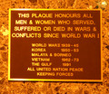
Lest We Forgetby KitaComment: a photograph of a plaque is not very dynamic or creative. the strong yellow cast greatly detracts from whatever interest this photo might otherwise carry |
 Photographer found comment helpful. Photographer found comment helpful. |
| 05/05/2006 11:37:02 AM |
|
| Photographer found comment helpful. |
| 05/05/2006 11:36:23 AM |
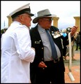
After The Marchby Penny LaneComment: good and crisp, nice control of a difficult lighting situation with the white coat right next to the black - bit too much neatimage for me |
| Photographer found comment helpful. |
| 05/05/2006 11:35:39 AM |
|
| Photographer found comment helpful. |
| 05/05/2006 11:35:04 AM |
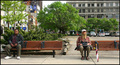
Two worlds - One bus stopby timfythetooComment: great candid - but is it newsworthy? as a photo I like it (especially the guy on the right), but I don't know what kind of news this would communicate |
| Photographer found comment helpful. |
| 05/03/2006 06:56:57 PM |
Sereneby GIS_boyComment: this is a stellar image. the colors just sing. did you use a starburst filter? |
| Photographer found comment helpful. |
| 05/03/2006 02:15:36 AM |
Functional Abstractby BeeCeeComment: I think this image was underscored. Honestly, I think a 5.7+ is more appropriate. The shapes and rhythm are very strong.
What weakens this most for me, I think, are the 3 blue spots in the black area (the light fixture, I guess). This picture is primarily graphical, and the blue spots distract from the clean geometry. the red tint at the bottom might be unnecessary as well - the color doesn't add much to the photo. the composition is strong enough that it works well as nearly pure tones. |
| Photographer found comment helpful. |
| 05/03/2006 01:07:45 AM |
blue noteby arngrimurComment: what Techo said. gorgeous geometry and color. this speaks volumes. |
| Photographer found comment helpful. |
| 04/15/2006 02:59:36 AM |
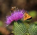
At the same tableby sfaliceComment: When I saw the purple flower and the butterfly in the thumbnail, I thought this might be a picture from your Napa trip! I love the springly (is that a word?) color palette, which produces a vibrance that is so welcome by now. So much rain and grey! It's nice to be reminded of the warmer, more habitable weather at a time like this.
So how did those Napa pictures come out? :) |
| Photographer found comment helpful. |
| 04/06/2006 10:16:28 PM |
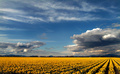
The Valleyby cabaComment: gorgeous scenery... processing is a little bit too heavy for my tastes - too much black & a bit too much saturation in the yellows (despite this being the yellow challenge) |
| Photographer found comment helpful. |
Home -
Challenges -
Community -
League -
Photos -
Cameras -
Lenses -
Learn -
Help -
Terms of Use -
Privacy -
Top ^
DPChallenge, and website content and design, Copyright © 2001-2026 Challenging Technologies, LLC.
All digital photo copyrights belong to the photographers and may not be used without permission.
Current Server Time: 05/09/2026 09:35:52 AM EDT.