| Image |
Comment |
| 11/09/2006 04:52:50 PM |
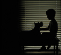
my palby lynnmarieComment: Originally posted by lynnmarie:
My choice to keep the negative space on the left... may have cost me some votes. |
Definitely! You captured a creat moment here with beautiful lighting, but the dark area pulls your eye away from the story IMO. Crop that out and this shot scores over 6.5 easy. |
 Photographer found comment helpful. Photographer found comment helpful. |
| 11/09/2006 11:47:52 AM |
Small Wonderby whiteroomComment: Personally, I prefer your B&W version. The only thing I can find that looks like pixelization is the uneven lower eyelid (but that's just looking too hard). This could almost pass for a Librodo shot... except that he almost always crops down to the forehead. Good job! My only (minor) gripes are the lack of shadow detail and the somewhat blank expression. |
| Photographer found comment helpful. |
| 11/08/2006 04:26:28 PM |
Model Shoot 7by elsapoComment: Geez... good thing you couldn't have two entries in the last challenge! |
| Photographer found comment helpful. |
| 11/08/2006 02:06:21 PM |
The Other Side ofby CutterComment: Maybe not a ribbon, but certainly underrated in this challenge. Should have been top 10. The people behind those 1 votes probably didn't have their blindfolds properly calibrated. |
| Photographer found comment helpful. |
| 11/08/2006 09:29:49 AM |
Harley #6by nsoroma79Comment: I think I like this one better as a portrait, but you certainly nailed Harley in your entry! |
| 11/06/2006 12:05:17 AM |
Wind Talking by QartComment: AGAIN?!? Geez, Rudy... forget about giving others a chance. At this point you need to stop ribboning just for variety! |
| Photographer found comment helpful. |
| 11/03/2006 11:51:06 PM |
|
| Photographer found comment helpful. |
| 11/03/2006 11:06:50 PM |
Autumn falls into winterby Sieruken7Comment: Ouch... not only the wrong challenge, but in a landcape format it doesn't fit the other challenge either. FWIW, the image itself had lots of potential. I'd suggest cropping about 1/2" off the bottom and showing more sky to get the horizon out of the center. Then I'd frame it and display it proudly as one of the prettiest sub-5 entries on DPC. ;-) |
| 11/03/2006 10:56:10 PM |
In My Roomby scarbrdComment: Well above average in this group. If it's a self-portrait, you're probably beating photographers with WAY more experience. Nice lighting and color, but I'd crop off the right side- a face positioned dead center like this usually creates a very static composition. Good job! |
| Photographer found comment helpful. |
| 11/03/2006 10:50:00 PM |
Some Day My Prince Will Comeby j8xmanComment: This seems to me like a "found" moment, where you happened to see the girl in a good spot and took the shot. Unfortunately, it's also a "lost" opportunity. The row of chairs and costume could have worked great if you had only taken it one step further: ask the girl to slump over with her chin in her hands and look directly into the camera with a sad, lonely expression. That would immediately communicate your concept. Then crop it slightly to lose the dark shape at bottom left and crop or clone out the stray leg at top right. Warm morning or late afternoon lighting would have added about a point to the score. As it stands now, I'd guess the dull lighting and lack of expression in a challenge that specifically called for it is probably keeping your average somewhere around a 5. Next time, you'll know. ;-) |
Home -
Challenges -
Community -
League -
Photos -
Cameras -
Lenses -
Learn -
Help -
Terms of Use -
Privacy -
Top ^
DPChallenge, and website content and design, Copyright © 2001-2026 Challenging Technologies, LLC.
All digital photo copyrights belong to the photographers and may not be used without permission.
Current Server Time: 06/16/2026 08:26:28 PM EDT.