| Image |
Comment |
| 09/26/2008 11:10:10 PM |
|
 Photographer found comment helpful. Photographer found comment helpful. |
| 09/15/2008 12:06:47 AM |
|
| Photographer found comment helpful. |
| 09/12/2008 08:28:31 PM |
|
| Photographer found comment helpful. |
| 09/12/2008 08:28:07 PM |
Day 23by sillygoatComment: Ohh, I want to see more of this outfit. I love this look (-; |
| Photographer found comment helpful. |
| 06/23/2008 04:24:33 AM |
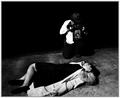
Murdered in the Dark "1951"by swordandsigilComment: Since I obviously left something to be desired with my during challenge comment; I will attempt to restate what I tried to say.
Also, considering my comment is the only comment not marked as helpful it must be the 'thought negative' comment in the scores thread for this challenge.
1. You have wonderful elements in this piece. In other words, I enjoy the style you chose and the props you used as well as the processing. There are good things going on within this image.
2. IMO the composition of this piece leaves something to be desired. You need to develop a stronger sense of composition and balance within the piece.
3. I believe that this piece is lacking something to give it POP! I personally would have enjoyed an element that gave me a greater sense of a crime scene and not just a body being photographed.
Overall, it is one of the better pieces IMO of the challenge. One of my higher scores was on this piece. Though overall I find it lacking the total package.
I hope this 'new' comment gave you perspective into my original comment. I also hope there are less grammar mistakes for you to weed through and be confused by. |
| 06/20/2008 04:10:38 PM |
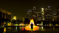
Overtimeby zackdezonComment: At first view the only part in my opinion that is high contrast is the man and the fountain. There is an overall extremely present medium tone throughout the entire image and medium is not a contrast. Least not to me.
Overall it is a nice image, though the slant of the buildings and the unbalanced weight really throws me off. Also, the orange, yellow, white of the fountain are too separated, as if levels where pushed hard to really make them stand out more.
I enjoy this idea, but believe it could have been done better. Maybe a different camera position, whereas only the tall multi-lighted/window buildings in the cluster are directly behind the fountain which is directly behind the figure? The figure also may be standing more towards the corner of the pad there. With that aspect it may make it easier to get a more uniform shape to the buildings, though without the proper tools they will slant, but if they slanted into each other other than leaning on one side I believe it would have really enhanced the image.
Also to keep the tall height aspect of the buildings a portrait crop would be much more beneficial. To me this is way to wide, and if the portrait crop was used it would have allowed for a greater 'contrast' to come through and thus I believe would have given this image a higher score possibility.
Andrew |
| Photographer found comment helpful. |
| 06/20/2008 04:02:16 PM |
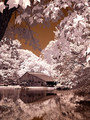
Through the Treesby brownsmComment: First thing I notice as I opened the image is that the leaves at the top of the image appear to be 'drawn' I do not think they are, they just seem like something I would find in a comic book. The various colour tones really give that aspect as well as the lack of detail in the leafs and sharp contours.
As I scroll down and view the whole image my first thought is, the voters would love this, even though it is not high contrast in my eyes. Personally for me there are way to many levels of tonal qualities to be a high contrast image.
The IR or affect you have on here does make a nice surreal image, though very comicy as I stated above. There is not really much else to say, the elements all work nicely together, though the foreground leaves distract a bit. Overall it is a very nice image, just not really high contrast. |
| Photographer found comment helpful. |
| 06/20/2008 03:41:54 PM |
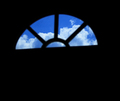
Why the caged bird sings...by egambleComment: Hi there, I look at this image and personally I do not feel it is 'high contrast'.
Also in viewing the window it seems to be out of focus, the edges are fuzzy and really gives a hard understanding for the eye to take in the image. If the edges of the window where sharp it would make much more of a dramatic statement.
Next, the angle of and size of the window compared to the whitespace does not work for me. It seems really displaced and offers no feeling of continuity or story.
The clouds I enjoy the composition of them through the window, though they seems to have a completely blue haze which really flattens them down and offers no real contrasts. Now if the contrasts where sharper with the clouds, the tilt was fixed to match the horizon or horizontal line and less whitespace was used this may have scored much better.
Overall it really leaves me the feeling of wanting something more, much more. |
| 06/16/2008 03:00:09 AM |
|
| Photographer found comment helpful. |
| 06/16/2008 02:59:41 AM |
|
Home -
Challenges -
Community -
League -
Photos -
Cameras -
Lenses -
Learn -
Help -
Terms of Use -
Privacy -
Top ^
DPChallenge, and website content and design, Copyright © 2001-2026 Challenging Technologies, LLC.
All digital photo copyrights belong to the photographers and may not be used without permission.
Current Server Time: 07/18/2026 06:48:20 AM EDT.