| Image |
Comment |
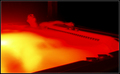
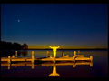
| 03/11/2007 03:00:41 PM |
Therapeuticby kleffmanComment: As much as I really enjoy these colours, I don't care for the effect. I like the idea and the angle/perspective, However, it feels blown out. I am assuming you used a longer exposure because it was dark out and the light came from the tub itself. I am curios though what a shorter exposure would do. IS the figure to dark? Maybe try again, but use a backlight and shorter exposure. |
 Photographer found comment helpful. Photographer found comment helpful. |
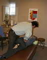
| 03/11/2007 02:58:53 PM |
The Chiropractic Twistby Catherine_BComment: The most interesting portion of this image, is the shadow casted by the light reflecting in the mirror on the bamboo plant. Although my back aches wanting this treatment, I find the image flat. I think maybe a face shot with some emotion would make a much dramatic appeal as well as a stronger angle and not from the perspective of someone standing there (feels snapshotish) Bring the camera close and personal hard angle and adjust the levels/curves a bit for a more poppier image. |
| Photographer found comment helpful. |
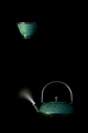
| 03/11/2007 02:56:11 PM |
Upliftingby aahutch1Comment: I like this concept, However, I don't care for the invisible bottom of the tea pot. I would have loved to see it sitting on something than the cup floating. |
| Photographer found comment helpful. |
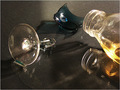
| 03/11/2007 02:55:06 PM |
Lonely Nightby NichtComment: bottle of apple juice? This could be a really fun image, its an nice concept however for me, there are several deficiencies. Some of those are not fixable within basic editing. What if you shot this on glass with a light from underneath and a dark background? Also put something up on the sites as to not get reflections, like sheets or posterboard (white) |
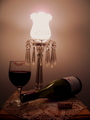
| 03/11/2007 02:52:35 PM |
Aromatherapyby J-MeComment: I really like this concept, However, it is flat for me. I would like more contrast to this image, and also maybe a greater dof The stand seems a bit oof. Overall I enjoy this image. |
| Photographer found comment helpful. |
| 03/11/2007 02:51:29 PM |
In the Center of Mother Nature's Careby jeroweComment: I really enjoy the colours here, although the figure is a tad bright for me. Also I would have liked to see a bit more on the bottom edge. It appears his head was cut off to top. Lastly I don't care for this style of border, I would much rather have liked a more uniform distance on all edges. |
| Photographer found comment helpful. |
| 03/11/2007 02:50:11 PM |
Heat and Cure ..by ChinhyukComment: I am trying hard to remember this, maybe not apparent to most people. However, I find the center focus and very small subject distracting, I would have liked to see a much closer version of this with more attention on the focal point. |
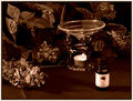
| 03/11/2007 02:48:41 PM |
MY "alternatvie medicine"by jolyn923Comment: I like the concept, however, the image is very small and the light itself really takes away from the effect the rest of the image can have. I would love to see a more advanced edit on this image. Maybe masking out the light so it is not so bright, and adding a bit more brightness to the glass/bottle/cork/doelly. |
| Photographer found comment helpful. |
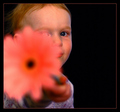
| 03/11/2007 02:39:36 PM |
Sniff this and call me in the morning : Aromatherapyby timfythetooComment: I really like this concept, it is fun. However, there are a few things that really distract me. For one, the flower, it seems very smudged/blurred blown out in my opinion. Very distracting and being a large part of the image, it really brings it down. Second, would be the colour on the kiddo. The darker areas look really dirty and flat. It appears the highlight areas like his cheek look really nice but the rest is icky. Also, the catchlight in his eye is really distracting as well.
I would really like to see this without the blur on the flower and more even lighting. |
| Photographer found comment helpful. |
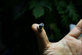
| 03/11/2007 02:22:58 PM |
Acupunctureby veganmegan23Comment: As much as I really want to go with you on this one, I finding it a bit of a strech but I understand why just doesn't go all the way with me. This could have been a really nice image as will, with a stronger dof and colour that popped a bit more. The water droplets are great, so maybe even a tighter crop or macro would have been nice. |
| Photographer found comment helpful. |
Home -
Challenges -
Community -
League -
Photos -
Cameras -
Lenses -
Learn -
Help -
Terms of Use -
Privacy -
Top ^
DPChallenge, and website content and design, Copyright © 2001-2026 Challenging Technologies, LLC.
All digital photo copyrights belong to the photographers and may not be used without permission.
Current Server Time: 07/24/2026 09:26:48 PM EDT.