| Image |
Comment |
| 04/28/2007 02:16:59 PM |
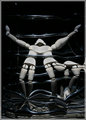
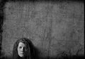
Warpedby ssodellComment: Very conceptual image, I think  Art Roflmao Art Roflmao would enjoy this much. When I look at this image, It seems more like a photograph, taken with a mirror distortion. It is very interesting to look at and takes me inside to look at all the details. However the flatness of the chest is really distracting for me. It appears almost out of place for the image. Just the chest colour throws me.
Also, even though I like a bit more symmetry I think this image is really heightened by being not symmetrical. The effect is really so funhouseish and moody. Very nice piece I think. Just wish for the chest to be a little more befitting. |
 Photographer found comment helpful. Photographer found comment helpful. |
| 04/28/2007 02:10:03 PM |
Bound Feetby zeuszenComment: Very interesting concept here. I know a touch about the bound feet thing, but not a lot. Without the title first thought in my mind was someone behind a bathroom stall. Here I would hope to see the 'bound feet' a touch better, maybe even showing the bindings a bit. What if one of the feet had part of the binding laying out? I think that would have made for a more dramatic feel. The screen is very surreal and graphical, it is as if the more I look at it the more it becomes pronounced. I really enjoy the textures and find it very pleasurable to look at. I think the feet are the major distraction, which is ironic because it is the title of the image. |
| Photographer found comment helpful. |
| 04/28/2007 01:39:58 AM |
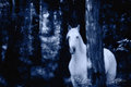
Elusiveby RistyzComment: This is a very interesting image, it pushes me out and pulls me in at the same time. Meaning, there is a distractive element within the details of the horse that makes me want to look away, but as I do, the shadows and lines of the trees pull me right back into the horse. A moonlight image, both smooth and sharp at the same time. Very interesting image. It makes me wonder what if this looked more 'painted'? It may add even another element. Very nice image. |
| Photographer found comment helpful. |
| 04/28/2007 12:54:18 AM |
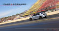
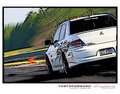
FF2SA-Straightaway Evolutionby m2iwComment: Like I said for the other image, I really like this style. However, I must say, the freeze-frame of this car leaves me lacking a bit. I love the dramatic motion blur of the stands the colours and lighting are fantastic. But, to see the car apparently sitting still, just throws me a touch. I think even if just a slight motion blur on only the trunk would add a much more dramatic feel. Otherwise I think its a fantastic image. |
| Photographer found comment helpful. |
| 04/28/2007 12:51:31 AM |
FF1SA BRevoby m2iwComment: I really like this style, the 'comic' style some people have called it when I use it. I have used it mostly on people though. I think you did a fantastic job here. The reflection in the side door, almost looks like a photographic reflection still. Not sure what to make of that, but I think overall this image is great fun. |
| Photographer found comment helpful. |
| 04/28/2007 12:48:42 AM |
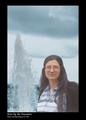
Kate by the Fountainby GeneralEComment: This image for some reason makes me think of Andy Warhol. I think because of the smoothness of the colours on top of the black and white, this gives an interesting feel. I do notice you flipped her around and moved her closer to the fountain. The smooth lines around her make this feel like two different images. Although, there is just something intriguing about it. It drawls me a bit and makes me wonder. I think the moving of the eyes really creates a little extra something for the image. Nice job. its fun. |
| Photographer found comment helpful. |
| 04/28/2007 12:44:04 AM |
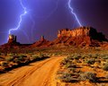
Desert Stormby ArtifactsComment: This image really borders I think on digital art. Even though to me, the image minus the sky does give a nice artistic feel for me, the sky itself totally throws me off and for me looks extremely out of place. The shadows are very pronounced and the placement of the lightning leads me to think the shadows would be a bit different especially on the tops of the plateaus. I like the lighting, and I like the plateaus and ground. I just personally don't care for them together. |
| Photographer found comment helpful. |
| 04/22/2007 11:52:55 PM |
Day 21 Something differentby ValdoComment: I really like this style, Just iffy on how sharp the glow is around the head. But this image itself came out really nice. I can never get the dragonizer to do anything decent for me L()L. Very nice job. |
| Photographer found comment helpful. |
| 04/06/2007 10:55:34 PM |
|
| Photographer found comment helpful. |
| 04/06/2007 10:54:32 PM |
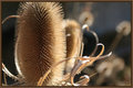
Thistleby daboardergirlComment: I can't think of what to say on how good this is, so I just faved it. |
| Photographer found comment helpful. |
Home -
Challenges -
Community -
League -
Photos -
Cameras -
Lenses -
Learn -
Help -
Terms of Use -
Privacy -
Top ^
DPChallenge, and website content and design, Copyright © 2001-2026 Challenging Technologies, LLC.
All digital photo copyrights belong to the photographers and may not be used without permission.
Current Server Time: 07/24/2026 06:24:28 PM EDT.