|
|
|
Showing 1251 - 1260 of ~2545 |
| Image |
Comment |
| 07/01/2007 01:22:31 PM | There Is No Spoon (The Matrix)by fotomann_foreverComment: I saw this thumb the other day when I looked at them all. I wonder to myself about the image. For me, I think there is just to much separation between the background 'matrix code' and the model. They don't feel connected in the image. Also, even though it is nice even lighting, it just bothers me for some reason, like it is 'too' clean for the concept of this image. |  Photographer found comment helpful. Photographer found comment helpful. |
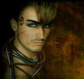
| 07/01/2007 01:19:41 PM | Drone-X by kiwinessComment: I like this concept, nice and simple, however, I don't care for the ringlight in his eyes. Also, for some reason, the cords look off to me, as if they might have been added after the shot was taken. The gold moreso than the other. | | Photographer found comment helpful. |
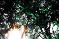
| 07/01/2007 01:18:03 PM | And they came, like a second sunriseby bledfordComment: I am staring at this image, and it just doesn't work anything for me. I am assuming from the title, you mean aliens or something where the bright spot is... yet, without anything but a bright spot to look at I am at a loss. If there was an saucer outline in the trees, or more definite figures it would have been stronger. as it is now, I just don't see it. | | Photographer found comment helpful. |
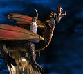
| 07/01/2007 01:16:09 PM | The Dragon Queenby TCGuruComment: I enjoy this idea, I believe this is more methos/fantasy than sci-fi. Here, I would really enjoy if the images came together more smoothly. The dragon still looks like a sculpture and there is something odd going on behind her head. I do enjoy the blue/black background, however, it isn't consistent the lower left corner is different. | | Photographer found comment helpful. |
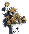
| 07/01/2007 01:13:38 PM | Thirstby OdedComment: I love this image. This is a Fantastic style, and I have fav'd it. However, for me, it has nothing to do with sci-fi. Granted I could stretch my imagination and come up with something.
'With the major pollutants of the 21st century's technology jumps, man has in affect exhausted their water supply. Even with the world being nearly three quarters water, the fresh water supply no longer exists except for a few heavily guarded mountain streams. The beautiful bright colours man has always loved, is only remembered by faded pictures and electronic images. The dried yellow and browns have since become the standard for all floral. Now, in 2112 there is a single emotion that both plants and man share in one, that is "THIRST"' | | Photographer found comment helpful. |
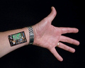
| 07/01/2007 01:07:40 PM | Bi-annual Tune-upby GreetmirComment: Fun idea, yet, the elements I don't feel are put together strong enough. I would see a straight arm/wrist as apposed to this angled version here. Also, The skin edging you created, doesn't give me a feel of robotics here. Classically this type of thing is created with torn flesh or straight edged box type of covering. The edgeing here, just doesn't seem to hold out enough depth for me. Also, I would see more mechanical functions in the wrist than electronically, lots of joints and stuff that need to move. but thats just my personal opinion. | | Photographer found comment helpful. |
| 07/01/2007 01:04:02 PM | Gulliverby Rino63Comment: I view this more as a fable than sci-fi. That being said, I think there needs to be more consistent lighting between both objects in the image. The two images appear very separated. Maybe a trick you could have done, is add shadows of the fingers/hands to the bottom of the shoe to add that connective element. | | Photographer found comment helpful. |
| 07/01/2007 01:01:52 PM | Xenomorphby superscrub99Comment: Plastic effect looks fun, the green background I enjoy. However, the 'chin?' piece just looks smudged around. I think I would have preferred a more streamlined look, plastic/metal. |
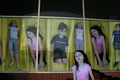
| 07/01/2007 12:59:56 PM | Clones For Saleby posthumousComment: nice idea, the children going down a slide helps create that 'pod' like feeling. I think that bothers me the most, are the reflections on the glass and the lack of consistency with the sizes. Also, the young lady in the front, does not stand out terribly much from the back. I think a little more separation would have been nice. I great idea all the same. | | Photographer found comment helpful. |
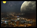
| 07/01/2007 12:57:38 PM | Cityscape in Spaceby PascalComment: What a wonderfully beautiful image, however, I find three things that distract for me, the yellow orb seems a bit out of place, the blue neon building off center, and the lack of reflection of the moon in the water. | | Photographer found comment helpful. |
|
Showing 1251 - 1260 of ~2545 |
Home -
Challenges -
Community -
League -
Photos -
Cameras -
Lenses -
Learn -
Help -
Terms of Use -
Privacy -
Top ^
DPChallenge, and website content and design, Copyright © 2001-2026 Challenging Technologies, LLC.
All digital photo copyrights belong to the photographers and may not be used without permission.
Current Server Time: 07/25/2026 11:59:19 AM EDT.
|