| Image |
Comment |
| 03/23/2006 01:57:27 PM |
I Love Youby ArcanistComment: Nice idea well framed, but you missed the full tonal range! no brights, just dark to midtones, it's like signing with one hand! Come on, work that histogram. |
 Photographer found comment helpful. Photographer found comment helpful. |
| 03/23/2006 01:53:37 PM |
Hand Selectedby BlownAwayComment: Tough to shoot so wide an exposure range, and while the action is well shot the hand itself is too dark to see the detail that is hinted atin the outline that is visible. |
| Photographer found comment helpful. |
| 03/23/2006 01:51:42 PM |
Work Handsby flip89Comment: I love the right side of this shot, but the left is all blown out or inky black. The gesture seems a bit oddd, but the skin tones are the best in he challenge so far, at least where you can see them. |
| 03/23/2006 01:48:40 PM |
Daddy's Always Thereby O'HolleranComment: beautifull gesture, well framed. the backround could be better, it is either blotchy or you have sensor dust, and it is too near in tone to the skin tone to allow the eye to easily follow this lovely composition. |
| Photographer found comment helpful. |
| 03/23/2006 01:46:23 PM |
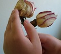
I'm sorryby evylynComment: clipping the top of the rose out of the frame hurts a nice job of moving the eye trough the frame. the light os flat and needs more pop to bring out detail in the back of the hand and to saturate the colors in the roses. |
| 03/23/2006 01:43:13 PM |
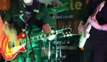
Band Handsby obsidianComment: too much band, not enough hands. nice colors and mood, but getting tighter on the hands of one player or the other would have worked better. |
| Photographer found comment helpful. |
| 03/23/2006 01:40:33 PM |
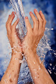
Refresh by JulieGComment: I wish the hands had a bit more shadow on some side or the other, the lighting is a bit too even making them look flat. Other than that, every thing is just right, ought to be top ten. |
| Photographer found comment helpful. |
| 03/13/2006 01:27:19 AM |
Caught!by RistyzComment: How this image gets this many votes below a five is beyond me. Keep up the quality of these shots, the scores will come. I was sure this would top twenty at least. |
| Photographer found comment helpful. |
| 03/12/2006 04:58:10 PM |
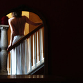
Mirror Imageby JutildaComment: I wish the balluster wasn't squeezed out tof the frame on the left, but the use of empty space on the right is great, the shadow controll on the model's back is quite fine and the colors and lighting create a tranquil fluid look that ought to score right up there in a particularly tough challenge. |
| Photographer found comment helpful. |
| 03/12/2006 04:55:16 PM |
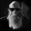
Untitled, 2006by pawdrixComment: I wish there was some light defining the shadow side and punch up the smoke against the dark, but on the whole it is a very nice shot. I particularly like the skin texture behind the sunglasses. |
| Photographer found comment helpful. |
Home -
Challenges -
Community -
League -
Photos -
Cameras -
Lenses -
Learn -
Help -
Terms of Use -
Privacy -
Top ^
DPChallenge, and website content and design, Copyright © 2001-2026 Challenging Technologies, LLC.
All digital photo copyrights belong to the photographers and may not be used without permission.
Current Server Time: 07/22/2026 03:35:32 PM EDT.