| Image |
Comment |
| 07/25/2004 12:48:48 PM |
Chocolate makes me smileby woodseyComment: What is it about m&m´s and hersays? It´s very good to put some work and effort into images but this isnt very original or well performed. It´s unsharp, the colorsaturation is dull and the background isnt very good. If you have PS, PS elements or other usable photoediting program. Go to Enhance > Adjust brightness/contras > Levels and sett the blackpoint so the background is totaly black. Sure that would have done something for this pic. Bye the same method you can increase the contrast pretty well. |
| 07/25/2004 12:43:44 PM |
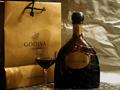
yummyby slingshotComment: Looks a bit like an advertisement for this drink but I think it needs some improvement in setup and technically for you to be able to sell this image to the company. Think 1/2 or 1 stop longer exposure would have given a better expression and then you can add more contrast, probably you need a better lightning. Also the WB should without a doubt be much warmer. The image needs tighter croping from above and from left. About the setup; the bag and the background paper have obviously been under to much usage to give good expression and are rather distracting.
But good experiment. |
 Photographer found comment helpful. Photographer found comment helpful. |
| 07/25/2004 12:35:13 PM |
Chocolate a la papierby greenmattComment: Not very original, technically badly performed and uninteresting. I´m not trying to hurt you and I´m sorry if I do but I think you should not spend my time and others bye submitting such images. |
| 07/25/2004 12:24:47 PM |
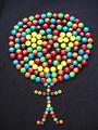
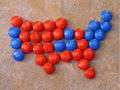
Red State, Blue Stateby KraahkanComment: The idea may be fine though I´m not sure it´s very original. Can´t say the image excites me a lot. The m´s are pretty unsharp and surely would have tolerated deeper and richer colorsettings. The backround isn´t either very good for my opinion. |
| 07/25/2004 12:18:12 PM |
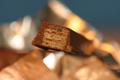
Have a Break, Have a Kit Katby jimikaComment: Good macro with extreamly shallow DOF. Still the background distracts a litle since it´s such a high contrast. But the idea is fine and pretty well performed. |
| Photographer found comment helpful. |
| 07/25/2004 12:16:01 PM |
|
| Photographer found comment helpful. |
| 07/02/2004 11:50:13 AM |
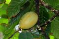
I am a Flowerby unknowndeathComment: The grainy "texture" gives it a original (extraordinary look). Since you are started why not giving it a more colorsaturation. |
| 07/02/2004 11:49:02 AM |
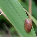
snail on a leaf?by hopperComment: Would have liked more colorsaturation and maybe contrast but very nice image though. |
| Photographer found comment helpful. |
| 07/02/2004 11:48:26 AM |
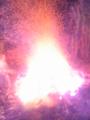
Furyby mariocauComment: Very strange hand hard to predict what we are dealing with here. But for sure its extraordinary. |
| 07/02/2004 11:47:24 AM |
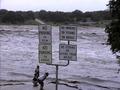
The extraordinary power of natureby CamrameComment: Great spot and moment you´ve captured there. The funny settings of the people adds very much to the image, extraordinary. The image seems a bit nosie or pixaleted but for the subject it doesnt destroy it. Maybe by given it a tighter croping, f.inst. by cutting out the sky it would have been still better. |
Home -
Challenges -
Community -
League -
Photos -
Cameras -
Lenses -
Learn -
Help -
Terms of Use -
Privacy -
Top ^
DPChallenge, and website content and design, Copyright © 2001-2026 Challenging Technologies, LLC.
All digital photo copyrights belong to the photographers and may not be used without permission.
Current Server Time: 07/18/2026 05:09:35 AM EDT.