| Image |
Comment |
| 07/17/2005 11:16:18 AM |
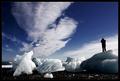
Nature photographer by heidaComment: I love the placement of the ice pieces as almost the basis for the sky to "grow out of them." The figture to the right grounds the image and I like him being in silhouette and not in color. The blue is stunning. The shadows along the ground and to the right are very effective in combination with the lighting. Perfect use of a simple black framing technique. 9 |
 Photographer found comment helpful. Photographer found comment helpful. |
| 07/17/2005 11:14:48 AM |
keys to the back roadby aplomb76Comment: This is really wel lthought out. I love the crusty mud on the base of the boot and the way you faded the sharpness as you go up to the top. The laces laying as they do draws your eyes to the outert edge. Perfect use of negative space with the white as the background to create contrast. 8 |
| Photographer found comment helpful. |
| 07/17/2005 01:55:46 AM |
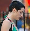
In Her Own Skinby charmayneComment: Great perspective on the challenge. Good colors. I notice you focused on her hair not her face - I get it!!! Way to go. |
| Photographer found comment helpful. |
| 07/17/2005 01:23:46 AM |
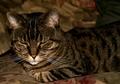
leave me aloneby speaseComment: Love this one. The ight is great. I like his whiskers. Good use of monochromatic theme. |
| Photographer found comment helpful. |
| 07/17/2005 01:21:11 AM |
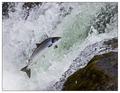
Free as a Fishby arnitComment: Love this. His color is beautiful and the contrast against the rushing water is great. 9 |
| Photographer found comment helpful. |
| 07/17/2005 01:20:35 AM |
|
| Photographer found comment helpful. |
| 07/17/2005 01:19:29 AM |
|
| Photographer found comment helpful. |
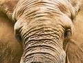
| 07/17/2005 01:18:36 AM |
Lone Elephant Bullby docpjvComment: Great texture and detail!!! I like this very much. Different take on the challenge. A for imagination. |
| Photographer found comment helpful. |
| 07/17/2005 01:16:57 AM |
|
| Photographer found comment helpful. |
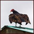
| 07/17/2005 01:15:05 AM |
On the Roofby cloudsmeComment: I hate vultures but this is really good. THe turquoise of the tin roof is a perfect contrast to his red head. The peak leads your eye up. I wish the sky were a tad more colored. Even gray would be nice. His feather detail is well done. |
| Photographer found comment helpful. |
Home -
Challenges -
Community -
League -
Photos -
Cameras -
Lenses -
Learn -
Help -
Terms of Use -
Privacy -
Top ^
DPChallenge, and website content and design, Copyright © 2001-2026 Challenging Technologies, LLC.
All digital photo copyrights belong to the photographers and may not be used without permission.
Current Server Time: 07/26/2026 02:54:55 PM EDT.