| Image |
Comment |
| 07/25/2005 12:01:55 AM |
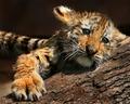
Feline love by arpitaComment: I'm so happy this got a ribbon. I was rootin' for ya!!! Congrats. |
 Photographer found comment helpful. Photographer found comment helpful. |
| 07/25/2005 12:01:24 AM |
|
| Photographer found comment helpful. |
| 07/24/2005 11:58:08 PM |
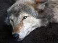
Take Me Homeby scrum8Comment: Looks like a magazine cover. This is just awesome. The light. focus and coloring. His eyes. It is just a lovely photograph all the way around. I'm upping this to a 10 in the last few minutes. IT is just outstanding. |
| 07/24/2005 11:56:47 PM |
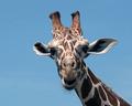
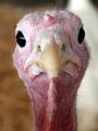
Funny Faceby MarjoComment: HELLO!! Isn't he dear? I love his expression. Nice use of light. I wish he had a twinkle in his eye, but the colors and capture is good! |
| Photographer found comment helpful. |
| 07/24/2005 11:54:50 PM |
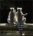
Meditationby vasilkovayaComment: Great shot with the backlighting. The tails intertwining is so cute. Last minute change of heart - I'm upping this to a 9. REALLY WELL DONE. |
| Photographer found comment helpful. |
| 07/24/2005 11:53:53 PM |
Born Cagedby Mr_PantsComment: Perfect lighting. The detail is just terrific. 10 in my book. I'm doing last minute reviews and stick to my original thinking. His whiskers and the black of his coloring is just awesome. You did great. |
| Photographer found comment helpful. |
| 07/24/2005 11:52:05 PM |
Deerby wardComment: Just love everything about this. The profile, his placement in the shot. The lighting. 10 for sure. P.S. The fuzzy background shows off his chin whiskers. hee hee - I stick by my original vote. Great!!! |
| 07/24/2005 11:51:11 PM |
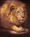
Lionizedby fulgentComment: He appears stuffed, right? The shot is really well done and the spotlight effect is quite effective. |
| Photographer found comment helpful. |
| 07/24/2005 11:50:49 PM |
Memories of Africaby dragonladyComment: What a kind old soul. I bet this elephant could tell some stories!! I like the soft dappled lighting. Nice capture! |
| Photographer found comment helpful. |
| 07/24/2005 11:46:04 PM |
|
Home -
Challenges -
Community -
League -
Photos -
Cameras -
Lenses -
Learn -
Help -
Terms of Use -
Privacy -
Top ^
DPChallenge, and website content and design, Copyright © 2001-2026 Challenging Technologies, LLC.
All digital photo copyrights belong to the photographers and may not be used without permission.
Current Server Time: 07/28/2026 11:18:02 AM EDT.