| Image |
Comment |
| 09/15/2005 11:12:33 AM |
|
 Photographer found comment helpful. Photographer found comment helpful. |
| 09/15/2005 11:12:07 AM |
Brothers in a Boxby reificationComment: HEE HEE. So cute but not in great focus. They look distorted for some reason. Hmm - maybe the filter? This has a snapshot quality to it. Maybe stage it and have them wearing clothes that aren't distracting and really work on the focus. They are adorable boys. |
| Photographer found comment helpful. |
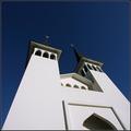
| 09/15/2005 11:11:04 AM |
two towersby arngrimurComment: Very crisp and linear. I like the shadows in the window openings. The contrast of the white and blue is spot on. |
| Photographer found comment helpful. |
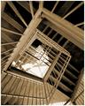
| 09/15/2005 11:09:20 AM |
Vertigoby sestevensComment: I like this alot. Staircases are so linear and cool. I'd like this in tack sharp focus and maybe more contrast. But the composition is good. |
| Photographer found comment helpful. |
| 09/15/2005 11:08:42 AM |
Sky Webby qmdiComment: I like the circle within the circle. This is interesting and the neon blue light helps it. Great for the challenge. |
| Photographer found comment helpful. |
| 09/15/2005 11:08:15 AM |
Our New Perspectiveby eslaydogComment: Darling little feet. I'd love this in REAL high contrast. Also if you could use advanced editing, a soft blur or diffused lighting filter might be fun. Sweet Sweet Sweet!!! 7 |
| Photographer found comment helpful. |
| 09/15/2005 11:06:56 AM |
Looking upby lytaComment: Nice job. I tried that and all of mine looked dumb. I like the fact that the flower is in the waining stage - not all fresh and perky. In a perfect situation, maybe there would only be one other blurred flower, but like I said..... in a perfect..............
Nice coloration. I wish the sky were bluer, but that's hard in daylight as the sky wants to blanch out. Nicely focused! I might have more negative (sky) space at the top. |
| Photographer found comment helpful. |
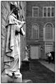
| 09/15/2005 10:58:55 AM |
In the Presence of Saintsby sibelingComment: Interesting - and I like the title. I like that the man is focused and the saints are not
I recognize St. Frances of Assisi - who's the other one? Nice linear quality to it with the architecture. Perfect use of black and white. |
| Photographer found comment helpful. |
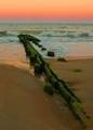
| 09/15/2005 10:57:39 AM |
Sunsetby RefocusedComment: This is very pretty. And different too. Not the typical sea scene, which I like. The oranges of the sunset reflecting in the tide is wonderful. Very interesting as the wood draws your eye out into the water. Perfect leading line. |
| Photographer found comment helpful. |
| 09/15/2005 10:46:24 AM |
Staircase Descending to Fish Pond by Keith ManiacComment: Oh this is very cool! Love the shape- like teardrops. The contrast is really good too. I tried to do a similar shot and failed. You did a good job. The symmetry is really powerful. |
| Photographer found comment helpful. |
Home -
Challenges -
Community -
League -
Photos -
Cameras -
Lenses -
Learn -
Help -
Terms of Use -
Privacy -
Top ^
DPChallenge, and website content and design, Copyright © 2001-2026 Challenging Technologies, LLC.
All digital photo copyrights belong to the photographers and may not be used without permission.
Current Server Time: 06/20/2026 10:35:58 PM EDT.