| Image |
Comment |
| 09/20/2005 04:38:04 PM |
|
 Photographer found comment helpful. Photographer found comment helpful. |
| 09/20/2005 02:20:41 PM |
Future Hallmark Card 2437.JPGby FotoMunkiComment: ROFL That is great. I remember getting in trouble because somebody had me do that behind the door at a friend's house. LOL
I wonder what the category in Greeting Cards would be? Congratulations? |
| Photographer found comment helpful. |
| 09/20/2005 09:50:58 AM |
LaCamas Lakeby ace flymanComment: This was a challenge right as I first joined or I would have certainly made a comment. I love the silhouette and the distinct clarity that defines the fishing rod, line, and the person. It is great! The lighting is just enough to make it work, yet you still know that it's late evening and he's there for the last catch of the night. The composition is spot on and his placement in the shot is realy good. I love the intensity of the blue in the sky. It would have received a high score from me. ;~D |
| Photographer found comment helpful. |
| 09/20/2005 08:36:11 AM |
Victoryby idnicComment: Greetings from the Critique Club!
At first view, this image has a gruff sense of it and your eye is drawn directly to the cigar and not the man's details. The lighting seems a tad harsh, giving an almost green cast to the skin tones. That might be remedied in post editing by working with saturation of colors. The crop seems a bit tight and his head has a "chopped off" sense to it. With the shortly shorn haircut and flag in the background, the viewer does get the sense that he's involved in the military somehow. The blue of the shirt is a nice compliment to the flag color, but again, the harsh lighting blanches it out a bit too much. This is probably due to the time of day in which it was taken. Intense summer lighting is brutal during mid day. I do see a tad bit of humor in that the cigar band mimics the flag, but I find it way too distracting for a true portrait image. If he were holding it in his hand with the smoke rising up, it might have been a bit more interesting, as it being in his mouth creates an unnatural facial expression and he almost looks mad.
Having looked at your "Sophistication" entry in high contrast, I know you certainly have a creative eye. It was rated one of my highest!
All the best in your future challenges - you have great work ahead of you.
All the best, Judy |
| Photographer found comment helpful. |
| 09/20/2005 08:28:23 AM |
Bonitoby NitinComment: Good morning from the Critique Club!!
At first view, this portrait is very appealing with it's spot on clear eyes and nice lighting. I sense a touch of yellowing which could probably be fixed with some post editing work of saturation adjustments. The composition is nice and the DOF is well executed. Her expression is pleasant and not at all cheesy. The lip color works well with her skin tones. If I were to nitpick anything, it might be the red track suit type jacket. In a perfect set up, I think I'd like to see more shoulder skin tones and maybe less of the top. I don't always like jewelry, but the silver earrings suit her so well and adds a nice contrast to her lovely black hair. Overall, this is well done with the unassuming sense that you get when photographing outdoors. You have a great eye and it certainly shows here. Best of luck with your future entries. And yes, Mansi is MUY BONITA!! Judy |
| Photographer found comment helpful. |
| 09/20/2005 08:20:02 AM |
Mischievousby pidgeComment: Good morning from the Critique Club!!
At first glance, one can't help but smile at the cute kid with his almost forced smile ;~D His backturned hat and rugby shirt help add to "boy next door" sense of it. The lighting seems a bit off as it creates an almost greenish cast to his skin tones. That might be remedied with post editing by working with curve adjustments and saturations of red and maybe slight desat of yellow. The composition is suited for a portrait but seems maybe a tad tight. Personally, I find the leaves a bit distracting, especially the one in the foregound (lower left). I'd like to see a little more clarity and "spark" to the eyes as well. Possibly, again, the lighting issue. Overall, it has great potential and with an adorable boy like that, you can't go wrong. Having looked at other photographs, you've taken, I know you have the eye and ability to do some great work! Best wishes in the future, Judy |
| Photographer found comment helpful. |
| 09/20/2005 12:13:44 AM |
Drowning in the Boxby StrikeslipComment: Again, like I said during voting - this is great and original and different. Thanks for being you, Slip!! I think it's terrific. Nothing like blue teeth afterward!!! |
| Photographer found comment helpful. |
| 09/20/2005 12:00:51 AM |
|
| Photographer found comment helpful. |
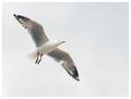
| 09/19/2005 11:53:51 PM |
Wherever the wind takes meby burtctComment: This is so free feeling. Don't we all wish we could fly just once? The placement of the bird in the shot is excellent. It has almost a celestial/heaven sense to it. He is beautiful and you captured such a simple thing so well. His slight color variations are apparent and the subtle sky is a nice touch. Really nicely done. |
| Photographer found comment helpful. |
| 09/19/2005 11:52:35 PM |
seeking beachesby dragonladyComment: This has a winsome quality to it. I love bicycles. They are round AND straight and when pushed by a human on a beach - you've got a nice composition. I wish the water were visible on the left. I like the staircase in the distance. This might be a great study in black and white if maybe the lighting were a bit brighter. I love the shadow too. |
| Photographer found comment helpful. |
Home -
Challenges -
Community -
League -
Photos -
Cameras -
Lenses -
Learn -
Help -
Terms of Use -
Privacy -
Top ^
DPChallenge, and website content and design, Copyright © 2001-2026 Challenging Technologies, LLC.
All digital photo copyrights belong to the photographers and may not be used without permission.
Current Server Time: 06/21/2026 05:12:24 PM EDT.


![Can't........Stop.......Clicking......[Update]](https://images.dpchallenge.com/images_portfolio/35000-39999/39349/120/Copyrighted_Image_Reuse_Prohibited_234138.jpg)