| Image |
Comment |
| 09/21/2005 11:08:55 AM |
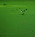
Swamp Creaturesby glodaComment: Oh funny. Love the title. How original. The vivid green is great with the chair poking up out of the water. I like this for it's abstract funkiness. 8 |
 Photographer found comment helpful. Photographer found comment helpful. |
| 09/21/2005 11:08:08 AM |
Openby wsteynComment: Wonderful macro. The blue and pink tones are a great compliment to each other. The luminoscity is lovely and the clarity of the center - spot on. Great DOF and the use of negative space works real well for the rule of thirds!!! |
| Photographer found comment helpful. |
| 09/21/2005 11:06:53 AM |
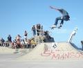
Flying High.by LewisellComment: Great stop action. I like the setting with all of the colors of the clothing and the graffiti but it is way over exposed. You might be able to remedy that by adjusting curves. |
| Photographer found comment helpful. |
| 09/21/2005 11:06:20 AM |
Sammiby SkamalComment: What a beautiful baby. His eyes are tack sharp. The shirt with it's design is a tad distracting - maybe throw a solid color blanket or have him wearing a solid color shirt. But overall, it is an excellent portrait!!! |
| Photographer found comment helpful. |
| 09/21/2005 11:05:02 AM |
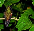
a break to meditate...by magueroComment: Nice vibrant colors. The holes in the leaf to the right is a tad distracting with the busy aspect of it. Love the bird's detail and clarity. The harsh lighting reflection on the stem might use some work but is hard under basic editing. Good placement and the DOF is well executed. |
| Photographer found comment helpful. |
| 09/21/2005 11:03:15 AM |
Moon Flowerby rileyComment: Love the idea and the contrast and composition BUT it is not nearly focused enough to give the Pizazz for a winning photo. If it were tack sharp, you'd really have a winner here. |
| Photographer found comment helpful. |
| 09/21/2005 11:02:41 AM |
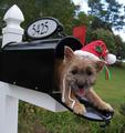
Here I Comeby hallswelComment: SO CUTE!! I like the DOF. What an adorable idea. A bit early for Santa's elf isn't it? hee hee
Good contrast and the clarity is good. Wish he had a sparkle in his eye more. Probabyl due to the lighting that day. |
| 09/21/2005 11:01:54 AM |
Listen to the Riverby msieglerfrComment: Interesting idea but I'm afraid with all of the editing or picture of art, it might be DQed. This was a basic editing challenge. |
| Photographer found comment helpful. |
| 09/21/2005 11:00:40 AM |
preserving natureby piticuComment: I like this alot. The horse's coloring is very striking with the white face. I'd like to see more contrast, but other than that, it's a nice shot. Maybe delete a tad of the foreground and it wouldn't mess up your rule of thirds, and actually might enhance it from a horizontal perspective. |
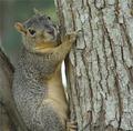
| 09/21/2005 10:54:15 AM |
A Tree Huggerby CamComment: AWWWWWWW. I would like to see it richer in tonality - maybe adjust the curves a bit. But the detail and the clarity is spot on. HEE HEE 7 |
| Photographer found comment helpful. |
Home -
Challenges -
Community -
League -
Photos -
Cameras -
Lenses -
Learn -
Help -
Terms of Use -
Privacy -
Top ^
DPChallenge, and website content and design, Copyright © 2001-2026 Challenging Technologies, LLC.
All digital photo copyrights belong to the photographers and may not be used without permission.
Current Server Time: 06/22/2026 06:23:20 AM EDT.