| Image |
Comment |
| 10/05/2005 09:39:43 AM |
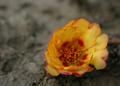
Almost Brownby TwylaComment: I would love for this to be on a solid black background and in tack sharp focus, as the blossom has the complementary colors and is very striking. |
 Photographer found comment helpful. Photographer found comment helpful. |
| 10/05/2005 09:38:27 AM |
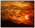
Design by Nature™by ajschelComment: Pretty vivid colors. This may sound trite, but I wish the rose had water droplets on it.
The DOF is good and the light and shadow of the rose petals create effective texture. |
| Photographer found comment helpful. |
| 10/05/2005 09:08:47 AM |
|
| Photographer found comment helpful. |
| 10/05/2005 09:07:46 AM |
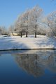
Park on Iceby viajeroComment: Heh, I was feeling the same thing. Just ran across this. What a great Valentine surprise. It looked like a Christmas card, didn't it??? |
| Photographer found comment helpful. |
| 10/05/2005 09:05:11 AM |
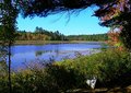
Algonquin-04-05.jpgby BMacDComment: Such a pretty setting. I like the light and vivid colors. Of course, I'd put a glow filter on it, but that's just me. LOL I love the natural framing. |
| Photographer found comment helpful. |
| 10/05/2005 09:00:17 AM |
Bird Hunterby npageComment: What wonderful emotive eyes. I just love the sweet kindness. Great pose. I'd love for the footstool to be a solid color, but then you'd have to redecorate your house. LOL |
| 10/05/2005 08:57:15 AM |
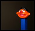
Yay!by mocabelaComment: Pez, baby. This would be a fun entry in complementary colors. I love Ernie. Thanks for the smile. Great composition and use of negative space. The lighting is spot on too. |
| Photographer found comment helpful. |
| 10/05/2005 08:46:24 AM |
|
| Photographer found comment helpful. |
| 10/05/2005 08:45:58 AM |
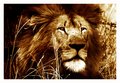
by whiteroomComment: AWWW What a sweet soul. The grunge makes him look old and wise. HEE HEE I do like it. You can do more lions as far as I'm concerned. I love their intricate faces! |
| Photographer found comment helpful. |
| 10/05/2005 08:39:05 AM |
Blackest Eyesby CorySmithComment: I like the originality of this alot. IT's spot on clearly focused as well. My only complaint is that the blue isn't more vivid and contrasting to the red. |
| Photographer found comment helpful. |
Home -
Challenges -
Community -
League -
Photos -
Cameras -
Lenses -
Learn -
Help -
Terms of Use -
Privacy -
Top ^
DPChallenge, and website content and design, Copyright © 2001-2026 Challenging Technologies, LLC.
All digital photo copyrights belong to the photographers and may not be used without permission.
Current Server Time: 06/24/2026 05:54:06 AM EDT.