| Image |
Comment |
| 10/13/2005 08:00:21 AM |
IMG_2408wee.jpgby browntComment: HEE HEE!! I love this. Darling face. Maybe tone down the blue tones a bit in the skin tones. The suds on the top of the head is a cute touch. Nice intensity to the eyes. |
 Photographer found comment helpful. Photographer found comment helpful. |
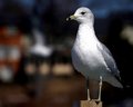
| 10/12/2005 10:30:33 PM |
Pole Sitterby FauxtoemanComment: Great DOF. I like the lighting and the closeness to the bird. Really well done. |
| 10/12/2005 10:27:29 PM |
Innocenceby idnicComment: Wonderful closeness. The eyes really do it for me. Great tight crop. What a beautiful face!! |
| Photographer found comment helpful. |
| 10/12/2005 10:26:16 PM |
|
| 10/12/2005 01:15:03 PM |
Hollowby SJCarterComment: Oh I simply adore this. The hands/eyes make the shot. You are quite photogenic, dirty and all. LOL
Keep up the good work. |
| Photographer found comment helpful. |
| 10/12/2005 10:57:17 AM |
The Boyby riotspyneComment: Oh the shadows are great. Love the filter too. Another good one. |
| Photographer found comment helpful. |
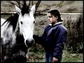
| 10/12/2005 10:55:48 AM |
Alone...by riotspyneComment: This hits me too. really nice filter. I love the gray/blue of it. The horse is naturally contrasting with the white face. Great emotion. |
| Photographer found comment helpful. |
| 10/12/2005 10:55:02 AM |
|
| Photographer found comment helpful. |
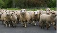
| 10/12/2005 10:54:41 AM |
sheep3.jpgby KarisMoComment: Oh this is screaming for post editing. I just love this. |
| 10/12/2005 10:54:03 AM |
Harsh Realityby SJCarterComment: Oh this one is great too. You almost look like you're deranged. LOL Great effect. |
| Photographer found comment helpful. |
Home -
Challenges -
Community -
League -
Photos -
Cameras -
Lenses -
Learn -
Help -
Terms of Use -
Privacy -
Top ^
DPChallenge, and website content and design, Copyright © 2001-2026 Challenging Technologies, LLC.
All digital photo copyrights belong to the photographers and may not be used without permission.
Current Server Time: 07/18/2026 01:50:42 AM EDT.