| Image |
Comment |
| 10/24/2005 08:39:18 AM |
Family Reunionby hideoutComment: HEE HEE - let's see, there's Uncle Joe, Aunt Miriam, my two cousins and my mother in law. Yep, they're all there!!!
I like the yellow/orange lights in the background. Not sure if the grain really enhances it, but the colors are fun. |
 Photographer found comment helpful. Photographer found comment helpful. |
| 10/24/2005 08:38:08 AM |
Mutual attractionby edmengComment: I like the idea of this but it's a bit too busy for my taste. It is way over exposed too, so the flowers are almost "hot" and the figure is too blanched out. Maybe an adjustment of curves would help. Also, utilize the 640 pixelation, so that you can maximize the size of the shot. |
| Photographer found comment helpful. |
| 10/24/2005 08:36:55 AM |
Category 5by cabaComment: I like the angle of this. The architecture of it works. I'd play with curves to really enhance the richness of the tones. The shadow and light is good. |
| Photographer found comment helpful. |
| 10/24/2005 08:36:16 AM |
|
| Photographer found comment helpful. |
| 10/24/2005 08:35:51 AM |
feel the noiseby tateComment: Oh this is great. I love the centered hand. This is really effective. It would be a fun shot in black and white with high contrast too!!! Very nice. 8 |
| Photographer found comment helpful. |
| 10/24/2005 08:34:54 AM |
Boogie boardin'by FlashComment: This is a great shot. Beautiful coloration and stop action. Where's the grain?? |
| Photographer found comment helpful. |
| 10/24/2005 08:34:33 AM |
Downtownby ElaineComment: Lovely colors. I like the little twinkly lights around the tree. The leading line is effective and the tree makes a nice natural frame. |
| Photographer found comment helpful. |
| 10/24/2005 08:33:32 AM |
The Millby peeceeComment: OOH what a pretty setting. I like the reflection. The colors are beautiful. I don't see how there is much grain though.This might be cool in sepia too! |
| Photographer found comment helpful. |
| 10/24/2005 08:21:33 AM |
|
| Photographer found comment helpful. |
| 10/24/2005 08:19:00 AM |
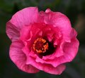
Hibiscus 8589by janrussComment: Wow another beautiful bloom. This really jumps out at you in the thumnails. Reminds me of those Mexican dancer's skirts as they twirl, spreading out the gathers. What a beautiful color. |
| Photographer found comment helpful. |
Home -
Challenges -
Community -
League -
Photos -
Cameras -
Lenses -
Learn -
Help -
Terms of Use -
Privacy -
Top ^
DPChallenge, and website content and design, Copyright © 2001-2026 Challenging Technologies, LLC.
All digital photo copyrights belong to the photographers and may not be used without permission.
Current Server Time: 07/19/2026 06:11:07 AM EDT.