| Image |
Comment |
| 10/26/2005 09:54:45 AM |
Heavenlyby BradComment: I think this would be more effective if the focus were tack sharp. the duplicity of the flowers is interesting and the DOF is good, but it's just too blurred. ;~( |
 Photographer found comment helpful. Photographer found comment helpful. |
| 10/26/2005 09:53:50 AM |
Eleganceby smilebig4me1xComment: I think this suits the challenge. Maybe the paled out wine glass could have a touch more appearance, but the design of the shot and the execution is spot on!! Or maybe it's just my monitor. LOL I love how the orchids arch up and over, creating a visual curve. Well done overall!! ;~ ) |
| Photographer found comment helpful. |
| 10/26/2005 08:37:54 AM |
Reflections of Prickett Damby ShutterPugComment: Great vivid colors. I like the complementary aspect of them. I didn't vote on this one. With two challenges going on, I can't seem to get to them all any more. Nice clear capture!! Congrats on the top 25 |
| Photographer found comment helpful. |
| 10/26/2005 08:26:40 AM |
|
| Photographer found comment helpful. |
| 10/26/2005 08:25:39 AM |
Bowls & Shells: White and Light on Whiteby Bear_MusicComment: This is an interesting composition. The curves of the bowls amidst the uneven shape of the shells. I almost think I might've liked it better without the bowls. The shadows are interesting but to me, the rims take away fom the interesting form of the shells. Hmmmm 7 |
| Photographer found comment helpful. |
| 10/26/2005 08:08:29 AM |
A Light Mealby ShermyComment: I find this as more white on white than light on white, but it is a well composed picture and it's quite appealing. Makes me hungry. :~D |
| Photographer found comment helpful. |
| 10/26/2005 02:02:23 AM |
|
| Photographer found comment helpful. |
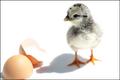
| 10/26/2005 01:59:40 AM |
... Chicken or the Egg? by banditComment: Darling little chick. Maybe a tad too dark for "light" but he sure is a cutie. The DOF is good and I like the composition. |
| Photographer found comment helpful. |
| 10/26/2005 01:58:29 AM |
|
| Photographer found comment helpful. |
| 10/26/2005 01:57:18 AM |
Helloby FyzarlComment: GOOD BYE. Sorry, this isn't light. It's bright and vivid on white. |
| Photographer found comment helpful. |
Home -
Challenges -
Community -
League -
Photos -
Cameras -
Lenses -
Learn -
Help -
Terms of Use -
Privacy -
Top ^
DPChallenge, and website content and design, Copyright © 2001-2026 Challenging Technologies, LLC.
All digital photo copyrights belong to the photographers and may not be used without permission.
Current Server Time: 07/20/2026 12:57:14 PM EDT.