| Image |
Comment |
| 10/29/2005 09:06:32 AM |
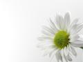
daisyby qbicleComment: I like this very much. The subtle difference between the petals and the background is nice. Not overblown of too much contrast. Simple and effective. 8 |
 Photographer found comment helpful. Photographer found comment helpful. |
| 10/29/2005 09:05:53 AM |
|
| Photographer found comment helpful. |
| 10/29/2005 09:04:55 AM |
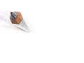
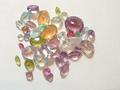
Rockhoundby Millere81979Comment: I like the color and sparkle of the jewels. Not the most exciting photo I've ever seen, but something about it is really appealing to me. |
| 10/29/2005 01:35:06 AM |
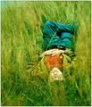
Daydreamerby JPRComment: This is fab. Almost dream like. Something about the green... I don't know. I just love it. The perspective is good and the sense of away from it all is great! |
| Photographer found comment helpful. |
| 10/29/2005 01:08:42 AM |
leavesby nowlinComment: Ordinarily, I wouldn't like the gravely ground but it goes perfectly with the leaves. It is a stunning shot. And so simple!!! I get rather metaphorical, but the two leaves remind me of two lovers draped over each other. Ok....... I'm getting way off. LOL
Lovely image. The yellow is bright and highlighted with teh huge droplets. |
| Photographer found comment helpful. |
| 10/29/2005 12:47:19 AM |
|
| Photographer found comment helpful. |
| 10/29/2005 12:27:03 AM |
yearbookcrap01.jpgby Joey LawrenceComment: I think that is stunning. Love the almost single saturation of green. Great clouds. The perspective is good. If that's crap - let's see the good stuff!!! (just kidding) |
| Photographer found comment helpful. |
| 10/28/2005 10:13:35 PM |
This Kissby CalliopeKelComment: This is totally fabulous. I love the sweet aspect of it. Really a nice capture. It's a touch soft- which is perfect for a cute buy and a bunny ;~D |
| Photographer found comment helpful. |
| 10/28/2005 10:06:21 PM |
|
| Photographer found comment helpful. |
| 10/28/2005 08:19:26 PM |
dsc_0042_v2bw.jpgby alien2thisworldComment: This shot has great potential. I can tell the eyes are clear, but I think the lighting behind the dog is hurting it. Hmmm - I wonder if you adjusted contrast or brightness would help. I love the pose and the DOF. |
| Photographer found comment helpful. |
Home -
Challenges -
Community -
League -
Photos -
Cameras -
Lenses -
Learn -
Help -
Terms of Use -
Privacy -
Top ^
DPChallenge, and website content and design, Copyright © 2001-2026 Challenging Technologies, LLC.
All digital photo copyrights belong to the photographers and may not be used without permission.
Current Server Time: 07/21/2026 11:59:37 PM EDT.