| Image |
Comment |
| 12/29/2005 09:26:21 AM |
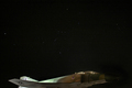
Jetstarby M.O.C.Comment: Pretty cool, but the bottom of the jet is chopped off and I feel like I'm missing something. I like the lighting and the dots of stars in the sky. Maybe more negative space to one side and the plane less centered would be more visually appealing. |
 Photographer found comment helpful. Photographer found comment helpful. |
| 12/29/2005 09:25:27 AM |
"Landscape" - Jon Bookerby KHoltComment: I had a poster of a similar shot and had it on the wall for years. Very serene. I wish there were more of the reflection of the trees in the water so we could see the complete reverse of the landscape. Lovely colors. |
| Photographer found comment helpful. |
| 12/29/2005 09:24:10 AM |
|
| Photographer found comment helpful. |
| 12/29/2005 09:20:00 AM |
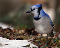
JayWalkby scalvertComment: Great close up but he seems ever so slightly out of focus. Darling bird and the colors are good. |
| Photographer found comment helpful. |
| 12/29/2005 09:19:31 AM |
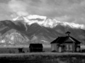
Schoolby vtruanComment: Pretty setting. I wish that there were more emphasis on the school but with the lighting as it is, you are drawn behind it to the mountain instead. Black and white certainly evokes a days gone by era feeling. |
| Photographer found comment helpful. |
| 12/29/2005 09:18:33 AM |
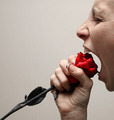
Rose6899by angela_packardComment: That's the most livid rose eater I've ever seen. ha ha ha ha
I like the saturation of color and the imaginative take. Nice detailing too. |
| Photographer found comment helpful. |
| 12/29/2005 09:17:42 AM |
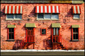
Pitsa Restaurantby pitsamanComment: I like the symmetry of the spacing of the windows and doors that are broken up by their variables (ie: different glass, stairs, curtains, etc). |
| Photographer found comment helpful. |
| 12/29/2005 09:16:28 AM |
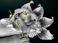
"footfungas" (Their spelling - not mine)by phylsy7Comment: HEE HEE - I don't see carnations and lilies as fungus but I do see the one mushroom. This is still a fun take on the challenge. I'd maximize my size by using the full 640 pixels allowed, so that we could see more detail. |
| Photographer found comment helpful. |
| 12/29/2005 09:15:13 AM |
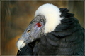
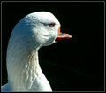
wackybillby espy2Comment: Poor bird!!! The lighting seems just a touch harsh. I do like the use of negative space to draw attention to the bill. |
| Photographer found comment helpful. |
| 12/29/2005 09:14:33 AM |
Monkeyby RefocusedComment: The eyes seem slightly out of focus. The detailing on the face is good. Makes me think of Roddy McDowell in "Planet of the Apes." |
| Photographer found comment helpful. |
Home -
Challenges -
Community -
League -
Photos -
Cameras -
Lenses -
Learn -
Help -
Terms of Use -
Privacy -
Top ^
DPChallenge, and website content and design, Copyright © 2001-2026 Challenging Technologies, LLC.
All digital photo copyrights belong to the photographers and may not be used without permission.
Current Server Time: 08/06/2026 11:28:52 PM EDT.