| Image |
Comment |
| 09/12/2014 09:11:21 AM |
|
 Photographer found comment helpful. Photographer found comment helpful. |
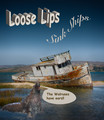
| 09/12/2014 09:10:22 AM |
Drink Up Boysby littlemavComment: Nice photo treatment. Not so much with the slogan and text - at least for me. I'm not talking about the message, I'm talking about the actual verbiage and text spacing. Lots of empty space and skewed text. I would have included the title on the poster. |
| Photographer found comment helpful. |
| 09/12/2014 09:07:54 AM |
Uprising!by mefnjComment: Well done but the colors seem a touch muted/yellowed. Was that intentional? |
| Photographer found comment helpful. |
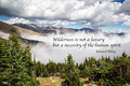
| 09/12/2014 09:04:55 AM |
|
| Photographer found comment helpful. |
| 09/12/2014 09:04:09 AM |
|
| Photographer found comment helpful. |
| 09/12/2014 08:59:31 AM |
|
| Photographer found comment helpful. |
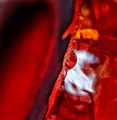
| 09/12/2014 06:35:46 AM |
study in redby sfaliceComment: Critique Club Comment:
I will apologize right up front and let you know that I've stared at this for 2 hours and have very little to say about it other than, "Yep. It's abstract macro. That kind of abstract macro." There's not much here to command my attention - even the desire to figure out what the heck it is (it looks like a partial white silk-screened logo on something red). I'm not crazy about the level of noise. Otherwise there's little I can critique because it's so abstract that I can't tell if what I would want to correct or do something about was accidental or intentional. I gave it a 5 because it fit the category and moved on. Obviously I'm not alone in my ambivalence towards this photo when I look at the voting breakdown.
I truly wish that I could give you some kind of real feedback on this. If you'd like to add some information to it other than your full EXIF, like what it is and what you were trying to say with the photo, I'd be happy to try to add some value to this. Otherwise, I'm sorry I couldn't be more constructive. Your "Study In Red" is absolutely lost on me. |
| Photographer found comment helpful. |
| 09/12/2014 02:13:54 AM |
An aged man is but a paltry thing, a tattered coat upon a stickby JakeKurdsjukComment: Originally posted by bmartuch:
A simple man, a simple life. This would have been fantastic in b&w. |
You would think, but no, it really doesn't. I spent significant time with it in B&W and while the subject looked great I couldn't get the opposing face to do much other than blend in with the background, and I wanted it to stand out at least a little rather than just be there to be discovered. |
| 09/12/2014 02:10:52 AM |
|
| 09/11/2014 10:09:46 AM |
Daybreak at Big Bay Lakeby juliannjComment: Critique Club Comment:
First off, let me compliment you on your view!! I'd love to be able to wake up to that every morning. Sunrises tend to disappear much faster than sunsets in my experience, to bravo on capturing a beautiful one.
While the scene is absolutely stunning, there are a few things with how you processed the image that made it less than ideal for me (I was one of your 5's). First off, as Devinder mentioned initially, the reds. They can be notoriously had to tame, especially with flowers, and while you've managed to preserve the details within them, they are certainly over-saturated. I'm also wondering if your color treatment didn't lose some of the wonderful oranges and yellows that are hinted at closer to the horizon? Selective color adjustments are always safer bets here, though a little more time consuming. Without knowing specifically what you did in post it's hard for me to suggest ways to correct or avoid doing this in the future, but beware of the Saturation slider as it can make some colors pop while simultaneously blowing out others.
Compositionally it is fairly sound, though the decking/walk in the bottom left is a little distracting. Were you to crop up from the bottom right corner (you want to save those blues) and land the horizon on the bottom Rule Of Thirds line I believe it removes enough of it to keep it from being a line that leads you away from the subject. One other little nit to pick for me are the vertical lines of the building. Camera angle has given you a slight forward tilt there that it easily corrected with a vertical perspective adjustment tool available in just about every editor.
I hope to see many more beautiful sunrises from you in the future!! Message edited by author 2014-09-11 10:13:32. |
| Photographer found comment helpful. |
Home -
Challenges -
Community -
League -
Photos -
Cameras -
Lenses -
Learn -
Help -
Terms of Use -
Privacy -
Top ^
DPChallenge, and website content and design, Copyright © 2001-2026 Challenging Technologies, LLC.
All digital photo copyrights belong to the photographers and may not be used without permission.
Current Server Time: 06/23/2026 07:31:42 AM EDT.