| Image |
Comment |
| 01/15/2008 08:07:52 PM |
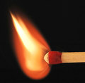
F I R E by sekarmalathyComment: Hi Sek,
Awesome image. Love your composition & framing. The details in the match head & stick are just incredible. This is how macro is done. The only thing I see here and it could go either way is the flame is a smidge blured for me. Other then that Fantastic image !!!!!! |
 Photographer found comment helpful. Photographer found comment helpful. |
| 01/15/2008 07:42:21 PM |
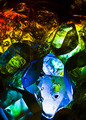
Blue Iceby SeniorChiefComment: Hi Chief,
I like the lighting used here but The image just doesn't hold my interest to generic maybe. I would have also liked to see the water from the cube be a little more transparent, it is difficult to distingush shadow from water. I also see a few dead pixels at the bottom right of the cube. Two distractions here are the little white flashs front of the cube & lower left hand corner both just kept drawing my eye. |
| 01/15/2008 05:02:09 PM |
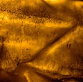
Icy-Hotby slaaksoComment: Hi Slaakso,
I don't know what to think of this and I think your score reflects this. I have no idea what I am looking at, fried wontons, broken bones i have no clue. As an abstract maybe but I just don't see the icy-hot at all, sorry. |
| Photographer found comment helpful. |
| 01/15/2008 04:46:06 PM |
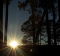
"Great Ball of Fire!"by 777STANComment: Hi Stan,
I like the idea and the effort here but it doesn't seem to have worked out. I get your title and it fits the challnge in my mind. The compositon seems to be slightly off most noteably the horizon it's cockeyed. The starburst is nice effect but you have some lense flare above the sun which is a distraction. Also the lower quater of the image you hve lose all detail including the cutting off of all the trees. I get the impression you where in a gully on an upward angle and it killed you. |
| Photographer found comment helpful. |
| 01/15/2008 04:02:31 PM |
Winter.by coryxmortonComment: Hi Cory,
I really like the image I can grasp the sence of cold, calm & peacefulness. The fact that you went wide here is real nice using the banks as strong lines bringing us thro the image was a nice touch a little to the left or right here may have been better but it works here. As you have seen in the comments below the power lines are a slight distraction. The one other thing here is the two trees, the brown leafs just kept drawing my eye. I don't think there was enough color thro-out the image to justify a color image, B&W would have been a better choice. Overall this is a great image. Keep up the good work. |
| Photographer found comment helpful. |
| 01/15/2008 03:09:15 PM |
Herkimer Diamonds on Iceby QuasimojoComment: Hi Qu,
I like the creativity of the image, the flow of colors are awesome the blues, green, yellows & reds are really nice !. The composition is well done as is the framing. What I think hurt you here are the dead spots, there are three - bottom third right hand corner. Just to the left of that where it goes up & left leaving the image. The other spot right side half way up the image. I looked at your other image ice3 & yes it is much cleaner and more compact I think it would have scored better. What is more of a concearn to me is the comment. The populist, I wouldn't worry about trying to satisfy everyone or one group this will only lead to three things. Frustration, second guessing yourself & your images, & taking away your creativity all of which are bad news. I have looked at your work it is wondrful. Just stick with your ideals & creativity the scores will come. |
| Photographer found comment helpful. |
| 01/15/2008 01:37:28 PM |
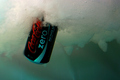
ICE coldby CboydrunComment: Hi C,
I don't know what your hands tho of this but I love the creativity here. The use of the coke can and all is great. The composition & framing are also great. I do see some color casting here sutle pinks and blueish green not sure if you picked up something outside the tank (background) it looks like it to me.It also looks like there is some water on the outside of the tank condensation maybe and it blured the bottom left of the can. I would have scored it higher on the creativity alone. |
| Photographer found comment helpful. |
| 12/02/2007 10:50:05 AM |
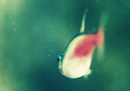
Swimby freakin_hilariousComment: Hi Freak,
I Like the compostion of the image and the back ground color fits nicely here. However the image seems out of focus. The belly is blownout & I really don\'t get the feeling of \"stopped motion\". The glass is a bit dirty which is a bit of a distraction also. Having a 220 gal reef tank & taken a number of images try this in the future. Leaving the pump system on use your flash above the tank app 24 to 30 inches from the top of water & position yourself 30 to 36 inchs from the tank. The water along with it\'s movement seems to defuse the flash just right. Also the use of a black light works wonders really brings out the color variatons of the fish and it\'s surroundings. |
| Photographer found comment helpful. |
| 11/29/2007 11:07:44 AM |
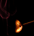
Ignites with Friction (1/2000)by marcusvdtComment: Hi Marc,
Wonderful capture, I really like the placement of the match here. The smoke is also placed well & it's color I think complement the image. The overall composition here is very well done. Love the timing catching the ignition with just a hint of flame it's really well done. The image is nice and crisp the colors are great not overpowering. I like the detail here catching the sulf coming off the match,excellent. Overall this is a really nice image and I would have scored it at 8. Great image !!! |
| Photographer found comment helpful. |
| 11/28/2007 11:13:43 AM |
Cyclopby TechoComment: Hi Techo,
Nice effort, The time an effort it takes captureing these images is remarkable. For those that complain about them try doing it first and find out what a major pain in the ass they really are :). As for this image I like the compostion, the placement is nice and I like the feel of motion you get at the bottom of the image and the stop motion on your main subject, nicely done. However I do think there is to much dead space here and the lighting is to strong causeing a bit of over exposure and a lose of some detail on the bottom third of the image. Maybe bounceing the light would have helped tone down the brightness a bit. Your main subject here could have used a little sharpening also. The use of the border here really didn't help much either. |
| Photographer found comment helpful. |
Home -
Challenges -
Community -
League -
Photos -
Cameras -
Lenses -
Learn -
Help -
Terms of Use -
Privacy -
Top ^
DPChallenge, and website content and design, Copyright © 2001-2026 Challenging Technologies, LLC.
All digital photo copyrights belong to the photographers and may not be used without permission.
Current Server Time: 07/17/2026 10:36:02 AM EDT.