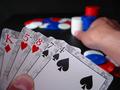
DPChallenge: A Digital Photography Contest You are not logged in. (log in or register
 
Browse Settings
Currently viewing:
Registered Userdpchallenger

Show comments:

Per page:

Order:

Comments:


Comments Made by dpchallenger
Pages:  
Showing 11 - 20 of ~24
Image Comment
Eye Variations
05/28/2002 10:50:00 AM
Eye Variations
by hokie

Comment:
Yikes....this one looks like a lot of work!!!
At The Beach
05/28/2002 11:22:00 AM
At The Beach
by ClubJuggle

Comment:
Argh, too bad about that person in the chair is there!
Photographer found comment helpful.
Waiting for Flight
05/28/2002 10:48:00 AM
Waiting for Flight
by bhop73

Comment:
I like the way this picture conveys killing time. However, I might've used a larger aperture to focus more on the people and keep the background (doors, etc) out of focus.
Day Dreamer
05/28/2002 11:12:00 AM
Day Dreamer2nd Place
by MrsKro

Comment:
Nice photo....but couldn't you have moved that broom handle from outside the window??
#1 KISS FAN
05/28/2002 11:07:00 AM
#1 KISS FAN
by Digiteyes

Comment:
Seems to be excessive shadows in the front and on the top left of his head.

That background is way too busy for a portrait. It keeps pulling the eye away from the person. Might've used a larger aperture so that it would've been blurry back there instead.

I like the pose and expression but the composition seems to draw the eye to the guitar instead of the person. Maybe a camera shift right might've helped.
Melancholy Sadness
05/28/2002 11:15:00 AM
Melancholy Sadness
by ritaard

Comment:
That big white space in the top left as well as that plastic thing on the wall are distracting. Probably not much you could do about the plastic thing but that big white space could be alleviated in a number of ways. e.g. 1. Crop it out e.g 2. Zoom in and recompose shot so camera view is more to the right.
Mind Games:  A game within a game
05/27/2002 02:38:00 PM
Mind Games: A game within a game
by dpchallenger

Comment:
Thanks for the comments everyone. I'd just like to address a couple of them here:

- Alignment on cards was a little off because the cards were new and kept slipping. All my older decks were beaten up and dirty.

- Thumb was white from gripping for the same reason as above (i.e. cards kept slipping)...I had to hang on tight.

- Tried the picture without showing the thumb but, in my opinion, it didn't look as good.

- Title WAS a little obvious but looks like a couple of people didn't get it. In case you're one of the ones that didn't understand what it meant: You can't get much of a worse hand than this one but I'm betting on it anyways (i.e. sliding the chips into the betting pile) and trying to fool the opponent into thinking that I have a better hand than I do in hopes that they'll "fold" (i.e. quit and leave the winnings to me).

- Tried as hard as I could to get rid of the reflections but in order to light them as well as the betting pile I needed 2 lights. The first light had to be RIGHT OVER the camera otherwise I'd get heavy shadows on the thumb. I tried to diffuse the light with a pair of white track pants but it only partially worked.

- No one's holding the camera! :o I had it on a desktop tripod and used the timer after locking the focus and exposure. I had to slide my left arm under the tripod or else it looked like my hand was coming in too far from the left.

- The King and 4 ARE out of focus...once again, the cards were new so they were slipping. As I gripped tighter the cards started curving. Guess next time I should paperclip them together or something.


in the water
05/19/2002 09:50:00 AM
in the water
by wolfjack

Comment:
Colors are a little faded...maybe some increased saturation might've helped? I think this would've looked really cool if you had dropped a pebble in the water near you to get some rings and then rotated the picture 180 degrees....would've looked like rings in the sky then.
erit
05/19/2002 09:53:00 AM
erit
by moondoggie

Comment:
Picture is crooked. Might have wanted to make sure the tire was level in the frame. Might also have wanted to align the chains so they were symettrical in the picture....i.e. the middle one vertical in the picture.
Golden Crystal
05/19/2002 09:48:00 AM
Golden Crystal
by pnicholls

Comment:
Little bit of light reflection in the top 3 glasses but overall I like the photo.
Pages:  
Showing 11 - 20 of ~24


Home - Challenges - Community - League - Photos - Cameras - Lenses - Learn - Help - Terms of Use - Privacy - Top ^
DPChallenge, and website content and design, Copyright © 2001-2025 Challenging Technologies, LLC.
All digital photo copyrights belong to the photographers and may not be used without permission.
Current Server Time: 09/14/2025 08:41:24 AM EDT.