| Image |
Comment |
| 11/07/2005 03:17:58 PM |
Different Destinysby CalliopeKelComment: Love it! My only nitpick is the front girl's right eye looks a little odd the way it is in the shadows. I'm looking for things though and really like a lot just the way it is. |
 Photographer found comment helpful. Photographer found comment helpful. |
| 11/02/2005 11:03:54 PM |
|
| 10/30/2005 12:44:45 AM |
ginny-2-color.jpgby jpochardComment: Originally posted by CalliopeKel:
I can't really imagine the light being any better. Perfect. |
We were in front of a good size picture window. Natural light is always so nice! I had a rod with sheer curtains that I put up to diffuse the light even more, and also to give a bit more privacy! (especially in the skimpier outfits!) It all looks nice and proper in the photos, but somethings were nipped and tucked a little more bare than others! LOL |
| 10/30/2005 12:40:56 AM |
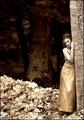
Dark & Luminousby CalliopeKelComment: Wow...I really like the effect you've given this one. It almost looks like it could have been taken in another century. I think you have a very artistic outlook on your photography and I love your stuff! Her expression and the gentle lean into the tree adds a lot of emotion that you bring out splendidly with the tones and the composition. |
| Photographer found comment helpful. |
| 10/29/2005 10:00:02 PM |
IMG_0002.jpgby hdogg4uComment: This is a great effect. Perfect choice to use it on this subject. |
| 10/29/2005 09:58:26 PM |
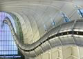
Structuredby hdogg4uComment: What a wild looking shot and perfect for this challenge. Lots of motion and leading lines. I like that you got the exposure just right to see the detail inside but not lose the blue sky outside. |
| Photographer found comment helpful. |
| 10/29/2005 09:55:53 PM |
IMG_1490editsepia.jpgby hdogg4uComment: I like the dreamy-eyed look to this one. I would suggest a bit more contrast (but I'm a contrast junky, so I say that alot!) I think I would also trim just a bit of the black off the left side. This pose is one of my two favorites of the series. (the other one being the one-eye pose) |
| Photographer found comment helpful. |
| 10/29/2005 09:53:39 PM |
IMG_1395editsofttoning.jpgby hdogg4uComment: This is also a nice pose, but it makes the lighting appear a bit harsh IMO. I think I would crop this just above the stone of the necklace. It gets rid of the dark shadow by her arm and I think brings the focus back to her face and to the eyes. I do like the expression. I would have liked a little more variety in her expressions throughout your posted portraits. |
| Photographer found comment helpful. |
| 10/29/2005 09:51:05 PM |
IMG_1414editbandwdarker.jpgby hdogg4uComment: This is fun. It really draws you right to the eye...which I wish was a bit sharper. The b/w works well and I think the tones are good. I like the uniqueness of the pose, but I think it would be better sharper. |
| Photographer found comment helpful. |
| 10/29/2005 09:43:37 PM |
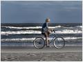
Missing Youby DeniseBernadetteComment: Great catch! Better, yes, if he was coming in from the left - but still a nice combination of elements here. I love the older looking bike, and I think it works out well that he's wearing natural colors to match the surroundings. The motion of the waves adds a lot too. It's often easy to blow out the details in the waves, but you nailed it. Good colors and exposure. |
| Photographer found comment helpful. |
Home -
Challenges -
Community -
League -
Photos -
Cameras -
Lenses -
Learn -
Help -
Terms of Use -
Privacy -
Top ^
DPChallenge, and website content and design, Copyright © 2001-2026 Challenging Technologies, LLC.
All digital photo copyrights belong to the photographers and may not be used without permission.
Current Server Time: 07/23/2026 10:57:11 PM EDT.