| Image |
Comment |
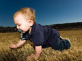
| 12/23/2005 03:24:33 AM |
At Dominik's Levelby livitupComment: He looks like a giant baby from this perspective :)
I think the face is a bit too bright (from flash?), and I would love to see him looking at the camera. Still, it is very cute. I like the feeling of movement from catching him in mid-crawl.
The slant to the background is a little distracting. Not bad. A keeper snapshot for sure! |
 Photographer found comment helpful. Photographer found comment helpful. |
| 12/21/2005 12:51:05 AM |
Fresh Snowby TommyMoe21Comment: This just has such a great, fresh feel to it. Wonderful exposure for the snow and twinkling lights. This is how a good photographer can take a pretty basic scene and create a really lovely photo. |
| Photographer found comment helpful. |
| 12/21/2005 12:24:43 AM |
Absolute Still by SkipComment: Really beautiful and earned that great score. Glad to see this one take the blue. |
| Photographer found comment helpful. |
| 12/13/2005 09:59:17 PM |
CRW_6562.jpgby EnnilComment: What a great job with makeup and editing for this series. How interesting it would be to see the original files these all started with!
They are not my style, but I find them very well done and interesting. Your "eye" for putting together the right tones, makeup and photos is perfect. Great job. |
| Photographer found comment helpful. |
| 12/08/2005 08:35:23 AM |
Seasons of Loveby sherComment: I love the effect of the blur in this photo. Simple, lovely and interesting. |
| Photographer found comment helpful. |
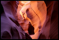
| 12/08/2005 08:29:19 AM |
Study in: Light, Form, Textureby tfaustComment: I think you did great with the richness of these colors and the exposure. Lovely composition and good, sharp focus. Really cool location captured perfectly! |
| Photographer found comment helpful. |
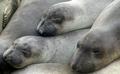
| 11/15/2005 11:55:07 PM |
Busy - Do Not Disturb!by iluvlifeComment: Awww...cute photo. Hello from the Critique Club.
Wonderfully clear and well exposed photo. I like having all three faces in the staggered positioning, and you captured those cute faces perfectly. Technically, I don't think there is anything that needs improvement.
I'm not sure I would give this many points for relationship to the challenge. Meeting the challenge theme is such a subjective thing, though. It does seem to be the opposite of what the challenge topic suggests.
The only other thing I can add is that my first impression of the photo was "Oh, how cute", but then the more I looked at the photo, the less it held my interest. I'm not quite sure why that is. I think perhaps because of the lack of any interesting color maybe a straight b/w treatment would be better? Also, I probably would have tried to see what simply more of a close up on one of the faces might be like. Perhaps a bit more impact?
All in all, just as it is, I like the photo very much.
I hope this is helpful! |
| Photographer found comment helpful. |
| 11/14/2005 03:52:33 PM |
DSC_0062-copy.jpgby dkubinComment: I love maternity portraits. They are quickly becoming my favorite thing to do. (I've done three couples so far.)
I like this overall, but I would make a few suggestions. I agree that it looks more out of focus than simply a soft effect. I like the black and white. I also like the bit of lace on the bottom, but I'm not crazy about the wrap around the top. I think I would have tucked it under the breasts a bit, or layered is a bit more smoothly.
Do you have others to share? I'd like to see them if you do. |
| 11/14/2005 12:03:00 PM |
Find 3 Thimbles...by PrismComment: I didn't vote on this challenge, but came across your photo later. I think it should have scored much higher. Perhaps not ribbon material, but at least over a "6". Creative idea and nicely photographed. |
| Photographer found comment helpful. |
| 11/08/2005 01:20:40 PM |
pdg-bus-card.jpgby pgattComment: Paul, I like the color you chose. I would agree that the "please check website" is not needed.
The font is easy to read, although I'm not sure about the size when this is reduced to business card size.
My only other concern would be the colored lines upper and lower. I agree it looks very nice as is, but if the cards are not cut evenly, you may see a difference in the amount of white left on the outside of the line and that might look bad. Just a thought. |
| Photographer found comment helpful. |
Home -
Challenges -
Community -
League -
Photos -
Cameras -
Lenses -
Learn -
Help -
Terms of Use -
Privacy -
Top ^
DPChallenge, and website content and design, Copyright © 2001-2026 Challenging Technologies, LLC.
All digital photo copyrights belong to the photographers and may not be used without permission.
Current Server Time: 07/23/2026 04:49:40 PM EDT.