| Image |
Comment |
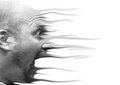
| 12/30/2005 12:06:28 AM |
Warpedby ArtysteComment: How fun is that?! Cool effect. Playing around is so much fun. I'd like to see this one in color. |
 Photographer found comment helpful. Photographer found comment helpful. |
| 12/30/2005 12:05:35 AM |
A Simple Loveby ArtysteComment: wow...not sure you need ANOTHER comment on this one! LOL I gave you a 9 on it during the challenge. The simplicity and lighting are wonderful. The very relaxed feel to the whole thing is a credit to you as the photographer. Love it! |
| Photographer found comment helpful. |
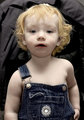
| 12/30/2005 12:01:19 AM |
Old-time Color Portraitby ArtysteComment: Awww...how cute! I'm not crazy about the lighting (especially the shadow on the mouth area) but the colors and expression are very good. Perhaps just a touch more pink tone to the skin would help, but that might just be a monitor difference.
|
| Photographer found comment helpful. |
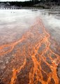
| 12/29/2005 11:40:48 PM |
excelsior_spring_algae.JPGby wavelengthComment: Nice eye to see this photo. I would just crop off the top part with the background and make it look more abstract. In the tumbnail, it did look like a lava flow! Kinda cool effect. |
| Photographer found comment helpful. |
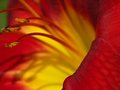
| 12/29/2005 11:38:00 PM |
lilly.JPGby wavelengthComment: Very pretty. I wish the angle was such that you could give a little more room on the left side of the photo, and still maintain the red/yellow majority in the pic. It is very firey with nice focus and dof adding to the light effect to make it much better than just a snapshot.
I like the colors a lot and I think this is probably one of those photos that look even better in a larger scale. Well done. |
| Photographer found comment helpful. |
| 12/29/2005 11:09:21 PM |
Family-Xmas-Vacation-205.jpgby TroyMosleyComment: Very pretty shot. Sounds like a great vacation! I would like to see maybe someway to highlight the texture of the water a bit more...maybe some burning or contrast? It's nice just as it is, but I'd probably play around with it some more. |
| 12/29/2005 11:00:02 PM |
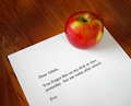
Adam's Appleby loz1Comment: Hello from the Critique Club!
Cool pun idea and a good one to photograph. You did well with this and there are only a few things I might think about doing differently.
I think it might carry a bit more impact if it was cropped in closer so that there wasn't as much table showing...maybe having the apple moved a bit more onto the note.
The other thing I would do is have the note handwritten instead of typed...especially being from a woman. I think it would have added a bit more flare to the shot.
The only other thing might have been to have a "prettier" apple; one of those nice and photogenic shiny red ones :)
Lighting and focus both seem to be fine and colors are natural and very good. The idea is always the hardest part, and I think it's evident that some thought went into this one. Well done!
I hope this is helpful.
Judy |
| Photographer found comment helpful. |
| 12/29/2005 10:53:57 PM |
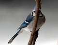
BIRDS EYE Viewby DrakeComment: Hello from the Critique Club!
Very clever and well done shot. I would think this would also do well in the DOF challenge.
Not much here I would change. I think I'd prefer a bit more crop off the right side to bring the bird just a bit more attention and to set it offcenter a bit more than it already is. I'm also a contrast junkie, so I would like to see the bird "pop" a bit more, particularly around the face and eye with a bit whiter white. It looks good the way it is, and that's such a matter of taste, but my opinion is that a touch more contrast would add to the shot.
The focus is wonderful and the dof really makes this shot work so well. Great colors and detail also. I did not vote in this challenge, but I probably would have given you a 6 or 7.
I hope this is helpful!
Judy
|
| 12/29/2005 10:47:23 PM |
Cloggedby sewkewlComment: Hello from the Critique Club!
I think this was a great idea for the challenge. I also think that a little more attention to set up and details might have made this more appealing.
For what it's worth, here are the things I think I would have considered doing differently.
In this instance, I think simple is best. The large sign, the pattern of whatever that is behind the sink, the dirtiness of the sink and clogs, and the out of focus foreground all seem to distract from the message of the pun in the photo. I would concentrate more on shooting at a different angle...perhaps more straight down toward the bowl of the sink to avoid the front lip and the background as much. It would help if the shoes had some color, but since they don't, I might think about changing this photo to a black and white shot.
A smaller sign, some clean up of the shoes and sink and a bit of shine on the faucet would bring more eye appeal and clean lines to the shot I think.
I think it was a great idea, and to me that's the hardest part to get right! I hope this is helpful.
Judy |
| 12/27/2005 02:42:49 PM |
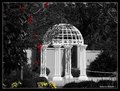
gazeboby ArpeggioAngelComment: This looks like a beautiful location....why in black and white? I think I'd prefer the full color version probably. The selective desat does not add anything to this subject for me. The whites don't appear to be blown out, which is good, and I really like the angle of the shot.
You might want to consider cloning out the chain against the bushes. I do like the framing here with the foliage, but I think doing it in color with perhaps a softer feel to the editing would suit my own taste better.
Nice set of photos. |
| Photographer found comment helpful. |
Home -
Challenges -
Community -
League -
Photos -
Cameras -
Lenses -
Learn -
Help -
Terms of Use -
Privacy -
Top ^
DPChallenge, and website content and design, Copyright © 2001-2026 Challenging Technologies, LLC.
All digital photo copyrights belong to the photographers and may not be used without permission.
Current Server Time: 07/24/2026 01:06:37 AM EDT.