| Image |
Comment |
| 07/12/2006 09:49:33 PM |
The Girl With Kaleidoscope Eyesby ColeyComment: Wonderful take on the challenge. Very creative. I will be interested in hearing how you did this. I'm assuming you probably printed out the fireworks and they are glued onto the eyewear? In any case, one of my favorites. |
 Photographer found comment helpful. Photographer found comment helpful. |
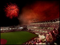
| 07/12/2006 09:47:53 PM |
And the Rockets Red Glare...by CutterComment: I wish the firework was a little more colorful, but the whole shot is great here. It has almost a Norman Rockwell painting feel to me...I think because of the couple in the foreground of the shot. The ballcap, the location and there study of the firework really give a nice perspective to this shot. One of my favorites for the challenge. |
| Photographer found comment helpful. |
| 07/12/2006 09:45:39 PM |
Small Town Americaby MarjoComment: I think this does a great job of just catching that feel for a hometown 4th of July. One of my top picks. |
| Photographer found comment helpful. |
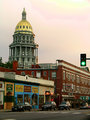
| 07/12/2006 11:04:52 AM |
Capitol from Colfaxby RebeccaComment: Again, I would clone out the traffic light. It really pulls the eye away from the subject of the shot. Looks like it's hard to get a really good composition of the capital with all that surrounding business area, but it does add a bit of perspective and placment for the building. I think your colors and tones were better in the closeup. |
| Photographer found comment helpful. |
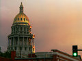
| 07/12/2006 11:02:21 AM |
Capitol at Sunsetby RebeccaComment: This has really artistic tones to it...like a painting. I would clone out the traffic light and rotate the pic a bit to the left to straighten out the dome.
Other than that, a very unique and lovely looking shot. |
| Photographer found comment helpful. |
| 07/08/2006 09:38:51 PM |
Sunrise on the mountainby igoofryComment: This is a lovely subdued shot with a nice capture of the mist. The tree in front adds interest and there is a real mood to the shot. |
| Photographer found comment helpful. |
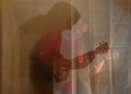
| 07/08/2006 09:27:33 PM |
Playing with shadowsby igoofryComment: This was a very creative idea and not a bad photo at all. I think it would have been more effective with the curtain pressed to get rid of the wrinkles. I would also go over and darken the shadow a bit more. This is not something I would have thought of and you came up with a good shot. |
| Photographer found comment helpful. |
| 07/08/2006 09:25:16 PM |
fpc2-dpc.jpgby Buckeye_FanComment: Very nice shot. It appears to be just a bit on the dark side on my monitor. You might want to play around with cropping in a bit closer to the building. To me,it also appears tilted ever so slightly to the right. Love the blue sky. |
| Photographer found comment helpful. |
| 07/08/2006 09:15:01 PM |
Postage Stampby TheStickComment: I liked this shot and don't know why it didn't score higher. I like the close up, the idea and the simplicity of the composition. You did a good job on this one. |
| Photographer found comment helpful. |
| 07/08/2006 09:13:55 PM |
Grooving Vanby TheStickComment: Like the color! Would have had more impact as a larger file size, and I think that might have hurt your score some because I would have given it higher. Nice composition and idea for the shot. |
| Photographer found comment helpful. |
Home -
Challenges -
Community -
League -
Photos -
Cameras -
Lenses -
Learn -
Help -
Terms of Use -
Privacy -
Top ^
DPChallenge, and website content and design, Copyright © 2001-2026 Challenging Technologies, LLC.
All digital photo copyrights belong to the photographers and may not be used without permission.
Current Server Time: 07/22/2026 06:07:33 PM EDT.