| Image |
Comment |
| 03/24/2004 06:43:20 PM |
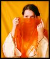
Arabian Dreamby gstrotmannComment: I think this would have been more effective with more of a close up. That way you wouldn't get as many of the wrinkles in the back ground as well. I would have cropped the left side just past her hand, and up from the bottom to where the trim is on the neckline. Still I think it's a nice shot for this challenge. |
 Photographer found comment helpful. Photographer found comment helpful. |
| 03/24/2004 06:39:22 PM |
Carrot sliversby andywightmanComment: I really like the way the grays set off the orange in this shot. It's simple, but I think it's eye-catching and very well done. |
| Photographer found comment helpful. |
| 03/24/2004 06:37:44 PM |
|
| Photographer found comment helpful. |
| 03/24/2004 06:36:42 PM |
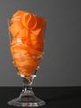
Love Potionby TommyMoe21Comment: This looks really red to me, but I'll give ya the benefit of the doubt on the color and call it orange. I do like it. I wish the front of the glass was more clear. It looks like it's frosted or smudged or something. I like the way the mat goes up in the back. |
| Photographer found comment helpful. |
| 03/24/2004 06:35:05 PM |
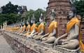
The Colour of Peaceby NatatorComment: Nice eye for this one. Cool how it goes all the way down the row. It will be interesting to see where this one was taken. |
| Photographer found comment helpful. |
| 03/24/2004 06:34:17 PM |
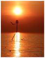
Autumn morningby pikytoComment: I really just love these kind of shots I just want to sit where this shot was taken and watch the sky. |
| 03/24/2004 06:33:29 PM |
Orange butterflyby ccraftComment: Nice shot. I would crop out some of that negative space. I like it, but I think there's just a bit too much of it. You probably didn't have long to take a shot of this guy, but I wish we could see a bit more of the surface of the right wing. |
| Photographer found comment helpful. |
| 03/24/2004 06:32:20 PM |
|
| Photographer found comment helpful. |
| 03/24/2004 06:31:45 PM |
A Different Time & Placeby TerryGeeComment: I like the sun coming in through the window with the light on the floor...but it's overdone - too bright. I would have liked to have seen more light on the chair, and less emphasis on the sunlight. |
| 03/24/2004 06:28:34 PM |
|
| Photographer found comment helpful. |
Home -
Challenges -
Community -
League -
Photos -
Cameras -
Lenses -
Learn -
Help -
Terms of Use -
Privacy -
Top ^
DPChallenge, and website content and design, Copyright © 2001-2026 Challenging Technologies, LLC.
All digital photo copyrights belong to the photographers and may not be used without permission.
Current Server Time: 07/25/2026 10:54:12 AM EDT.