| Image |
Comment |
| 04/26/2004 12:39:00 AM |
Cannon Beachby ZoomdakComment: Nice of the bird to stop by and pose for you! Lovely shot. The water in the front looks a little over sharpened or something, but it's a minor thing. I think the composition is excellent. I might also run it through Neat Image or the like to try to reduce some of the noise. |
 Photographer found comment helpful. Photographer found comment helpful. |
| 04/26/2004 12:37:26 AM |
|
| Photographer found comment helpful. |
| 04/26/2004 12:36:58 AM |
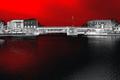
My City's Sitesby ellamayComment: Nice shot. I'd be tempted to crop off just a little more from the bottom. I think the darkness of the land detracts just a bit too much from the nice subtle blues of the water, hills and sky. I'd leave some, but not quite as much. |
| Photographer found comment helpful. |
| 04/26/2004 12:35:11 AM |
Spring Parkby CreativeFlyPhotoComment: I really like the mood of this shot. Even the dog looks relaxed! I like the composition, with the man and dog in the lower portion of the frame. |
| Photographer found comment helpful. |
| 04/26/2004 12:33:44 AM |
|
| Photographer found comment helpful. |
| 04/26/2004 12:33:13 AM |
forever trappedby xburnerxComment: Nice golden colors. I don't think the size of the post will do this photo justice. In this smaller size it's difficult to determine much of the detail. |
| 04/26/2004 12:27:10 AM |
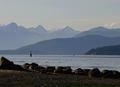
My city by the seaby heidaComment: I love the drama of the colors in this shot. The exposure, lighting, and contrast with the clarity of focus make this one stand out. |
| Photographer found comment helpful. |
| 04/26/2004 12:13:39 AM |
Drifting into the sunset by trainComment: This is really just beautiful. It's always a challenge to capture a moment that's really out of your control - and you captured this one wonderfully! Congratulations on you first place win! |
| Photographer found comment helpful. |
| 04/22/2004 10:34:46 PM |
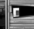
Unable to Occupyby amyleighComment: Hello from the Critique Club.
I am having some trouble trying to figure out what your shot is supposed to be. It looks like maybe the opening from the back of a building looking to the inside and a door at the other end with the sign? The sign is very hard to read.
The black and white seems to work well with the metals and textures of the shot. I'm not sure I would have left the portion on the left visable (is it a reflection?) It doesn't seem to add anything to the composition and it detracts from the main focus, in my opinion.
Overall, I think the difficulty in figuring out the subject and straining to read the sign take away from the interest of the shot. Since the sign is hard to read anyway, perhaps pulling back a little to get the perspective from a bit of a distance might help.
I like the fact that it is different from other window shots.
I hope this is helpful and good luck in the challenges! |
| 04/21/2004 09:02:26 PM |
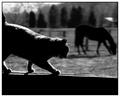
Copycatby MarjoComment: Very nice capture. I love the way the stances are the same! |
| Photographer found comment helpful. |
Home -
Challenges -
Community -
League -
Photos -
Cameras -
Lenses -
Learn -
Help -
Terms of Use -
Privacy -
Top ^
DPChallenge, and website content and design, Copyright © 2001-2026 Challenging Technologies, LLC.
All digital photo copyrights belong to the photographers and may not be used without permission.
Current Server Time: 07/27/2026 05:05:55 AM EDT.