| Image |
Comment |
| 05/09/2004 09:18:18 PM |
Ruralby amsmythComment: Hello from the Critique Club!
This is really a nice rural shot, and I think it's a strong connection to the idea for the challenge. It's a nice setting with some interesting features - the silos, hills in the background, the greeness of the area against the white buildings and greenhouses. They all work well together here, I think.
I agree with everyone else that the biggest change I would make to this shot is to adjust the rotation to correct the "tilt". I might also like to see the colors brightened up just a bit, but others may have a different opinion on that.
Cropping seems to be okay. I might also crop out a little more on the left hand side to bring the focus more on the main part of your scene.
It's an nice entry for this challenge. I hope this has been helpful! |
| 05/09/2004 09:12:48 PM |
April Showers in the Northwestby goinskiingComment: Hi there from the Critique Club.
I like the colors in this shot. No, it doesn't "pop" out at you, but not all photos are meant to do that. This just has a nice, natural feel to it. I would have liked a little more emphasis on the main flower section with the water. I do like the dof although it appears to me that the main subject is a little out of focus.
As for meeting the challenge, I agree with some of the commentors that this shot doesn't strike me as having a strong element of where a person lives. I wouldn't deduct anything because I can see how it could work - but I wouldn't add anything to the score because it's really not a strong part of the photo.
I also think that the very slightly faded edge works with this shot.
Nice job! I hope you have found this helpful. I always enjoy seeing your shots and comments in the forums. |
 Photographer found comment helpful. Photographer found comment helpful. |
| 05/04/2004 10:55:59 PM |
The Upstairs Maidby jodiecostonComment: Okay...I guess this is an older photo from a challenge last year - but the first thing I thought of when I viewed this it "Wardrobe Malfunction"! :) Really, I think it's a great shot and I've enjoyed looking through your photos. |
| Photographer found comment helpful. |
| 05/04/2004 10:34:56 PM |
The Lucky Lotto Ticketby MichaelsComment: Hello from the Critique Club!
This is a fun entry! Who hasn't dreamed of instant fortune? I like the composition of the photo. There is no question what the shot is meant to be about. The placement of the large "LOTTO" text brings the subject out immediately.
Of course you have all the voters wondering if this actually happened! I'd say you probably printed up the report behind the ticket to use as a prop for the shot. I think it's done very effectively. The placement of the pen, the circling of the numbers...it all adds up to a wonderful serendipity shot.
As for meeting the challenge....hmm, that's a tough question with this challenge. I guess it doesn't quite meet my own definition for serendipity, but it's close. It strikes me more as luck.
Technically, I think it's very well done. Good focus, lighting, and colors. I can't think of anything that I would like to see done differently.
Great job!
I hope you find this helpful. |
| 05/04/2004 07:16:36 AM |
The Elements of Subject & Hopeby BradComment: Hello from the Critique Club!
Who hasn't hoped to get something good in the mail? I think this is a great shot for the challenge.
Technically, My first impression is that it's very good....clear focus and nice depth to the colors. I'm assuming you probably tried different angles. I would like to see how a more "straight on" angle to the mailboxes, looking up to include the street sign might have worked. With this one, the sign just seems a bit far away from your main subject - the boxes. I would have fooled around with the angles to try to get an illusion of the sign being closer.
Good job!
I hope this has been helpful. |
| Photographer found comment helpful. |
| 05/04/2004 07:08:39 AM |
Blythe Boutiqueby johnmComment: Hello from the Critique Club!
Serendipity? Hmmm....I can't figure out the connection myself at all - but perhaps this has some meaning for you? The subject itself and the connection to the challenge for the average viewer is probably not very interesting.
The photo quality isn't bad. Good colors and pretty sharp focus. It would have been nice to find some way to avoid the glare off of the doll's face. Really, though, nice close up shot without much to go against it for the photo.
Hope this is helpful. |
| 05/03/2004 12:07:58 AM |
Oceanside California by thelselComment: Hey...I actually got this one right! You were up against some very good shots, and I'm glad this one won. Congratulations. |
| Photographer found comment helpful. |
| 05/02/2004 06:46:27 PM |
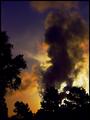
Steamby kellianComment: Hello from the Critique Club!
I really like the dramatic effect of the colors in your photo. I even like the border around it.
When I think of sillhouette, I don't think of something like steam, but I think it works okay here. The inclusion of the trees frames it very nicely. Your use of neat image helps the colors and the photo. I think the highlighting of the golden sun around the steam and clouds is what makes this image so strong. Whatever editing of levels you did worked to bring that out perfectly.
I don't recall how this one ended up doing in the challenge, but I like it alot. Good job!
I hope you find this critque to be helpful.
|
| Photographer found comment helpful. |
| 05/02/2004 06:39:54 PM |
Floating the Hood Riverby goinskiingComment: Hello from the Critique Club,
I'm a sucker for sky shots (sunsets and sunrises) so this one caught my eye right away. I really like the sky here and that you made use of that colorful backdrop was probably a good idea.
The subject itself (the boat),is not a strong subject for the sillhouette challenge. The positioning of the boat as it is loses the top part of the boat into the shoreline. There's really not enough light on the water to make the boat stand out very well, but it appears that the boat is slightly out of focus as well. Or at least, the edges are not very well defined.
I wish this could have been captured at a different angle so that the boat was sillhouetted against the sun.
Still, not a bad shot at all. It gives a nice feel to the end of the day and has a relaxing tone to it.
I hope you find this critique helpful! |
| Photographer found comment helpful. |
| 05/02/2004 06:32:17 PM |
"The Creation of Adam" by Michelangeloby labudsComment: Hello from the critique club!
Knew right away (obviously) that this was from the sillhouettes challenge. That's always a good sign - definitely meets the challenge.
I really like the creativity of this shot. The positioning of the hands and use of the light is perfect I think. Good use of your filters to even out the lighting to help get the effect you wanted and good editing to get them just right. I even like the fact that the sky is somewhat featureless here. A lot of color or clouds in the sky would have detracted, I think, from your main subject.
I'm not a big fan of this border. I don't think it's too bad, but I also don't think it really adds anything to the photo.
Overall, I think it's a quality shot which shows creativity and skill at your photography. Good job!
I hope you find this critique helpful! |
Home -
Challenges -
Community -
League -
Photos -
Cameras -
Lenses -
Learn -
Help -
Terms of Use -
Privacy -
Top ^
DPChallenge, and website content and design, Copyright © 2001-2026 Challenging Technologies, LLC.
All digital photo copyrights belong to the photographers and may not be used without permission.
Current Server Time: 07/27/2026 01:52:24 PM EDT.