|
|
|
Showing 1591 - 1600 of ~2606 |
| Image |
Comment |
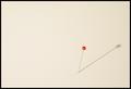
| 06/30/2004 10:20:51 PM | Ya' Pinheadby StevePaxComment: Really cool idea for this challenge. I agree with some of the others that a whiter background would probably enhance the idea a bit, but I do like what you have here.
The shadow works to add interest without "overshadowing" the pin. I'm just not a big fan of the minimalistic sort of photos, but I think this one is well done. |  Photographer found comment helpful. Photographer found comment helpful. |
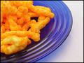
| 06/30/2004 10:16:18 PM | Cheesy and Crunchy - Orange on Blueby StevePaxComment: This one has the 3 c's - Clarity, color, and composition. I was expection mac & cheese from the thumbnail, so it was a bit of a surprise. You picked just the right plate to make this look artistic - the blue is the perfect shade and the curved lines really help the look of the photo.
It's not something I would hang on my wall, but for what it is it's very well done I think. | | Photographer found comment helpful. |
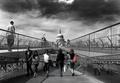
| 06/30/2004 02:27:14 PM | Colourful Mindsby jonpinkComment: Hi from the Critique Club.
When I receive a photo to critique, I first look at it without the title or other info to see if I can guess which challenge it is from.
This one was obvious! I did not vote in the desat challenge, but I would have given you one of my 10's (I'm very stingy with them!) I think this is an awesome shot.
What strikes me about it first off is the intensity of the black and white. It has a very dramatic feel to it, certainly enhanced by that sky - and I think the colors help play up that fact. My only nitpic with the exposure or levels is the bright white shirt walking toward the viewer. It's a little distracting, but that's nitpicky.
The composition is perfect in my opinion. The lines compliment each other and lead the eye to the center and down the walkway. The people being scattered just a bit give it some movement and a bit of a journalistic feel, I think.
This is really an artful photograph and one of my favorites for this challenge. Congratulations!
Hope you find these comments helpful. |
| 06/30/2004 10:29:25 AM | Phillies down Royals 4-2by ClubJuggleComment: ~sigh~ We (Cincinnati Reds) are in desperate need of a "real" closer. Think you could ship him over here? By the way...nice shot. I've never been able to get one this close. This really looks like it could be on the sports section of the newspaper. | | Photographer found comment helpful. |
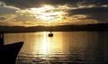
| 06/29/2004 05:10:06 PM | Getting Late, should I stay or should I go?by DvanComment: Hi from the Critique Club.
When I critique a shot, I first look at the photo without the title or other information and try to figure out which challenge it was from.
I really had no idea which challenge this would be from, althought I thought it might do nicely for sillohuettes, I knew that was too long ago to be getting critique photos. My first impression is that it's a very nice setting and photo, but I don't see much of a connection to the challenge.
I really like the golden tones of the evening light within the clouds and on the water. It does give a somewhat dramatic feel to the shot. Other than a poor connection to the challenge, I think the weakness of the photo would be in the composition / cropping. I like the exposure and the focus seems okay...although the boat could be a bit clearer.
For the composition, I would prefer totally cropping out that dark shadow on the left (the front of another boat?) I would also crop slightly from the right side which is just a bit too dark for my tastes. With that cropping, your boat would be a little less centered in the photo, and I think it would have a greater impact on the viewer.
It sure is a nice scene to capture, and I think with a little different cropping and experimenting with the photo it would be a nice keeper.
I hope these comments have been helpful.
Judy | | Photographer found comment helpful. |
| 06/29/2004 03:40:58 PM | Strong Bones/ Weak Bonesby kateasanovComment: Hi from the Critique Club.
When I critique a shot, I first look at the photo without the title or other information and try to figure out which challenge it was from.
This one was easy to figure out, so you have the connection to the challenge, although I don't think it's a particularly original one.
Technically, I think you've done okay here. The colors and lighting seem a bit flat to me, but not too bad by any means. The focus seems good and the image is clear.
For me, what disappoints in the photo is the subject and composition. A can of coke and a glass of milk next to each other just don't hold my interest, even though it does meet the challenge. They are just placed side by side in a mostly centered composition that adds no interest to an already so-so subject matter, in my opinion.
It is very difficult to come up with ways to make a photo carry some sort of "wow" factor - and maybe for some folks this has it, but not for me. I'm not sure how I would improve it. Maybe if the glass and can were on either side of a balance scale or something like that to add interest. I would say to keep trying though and I hope these comments have been helpful.
Judy |
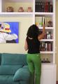
| 06/29/2004 03:26:32 PM | wich one?by vaguiloComment: Hi from the Critique Club.
When I critique a shot, I first look at the photo without the title or other information and try to figure out which challenge it was from.
I was able to do that rather easily with your shot, so it did fit the challenge. The lighting and focus are done well and you have a nice clear shot here.
The idea of choosing a book to read is, I think, a nice idea to convey in the challenge, but I think the composition here could be improved to have a greater impact and get the point across more clearly.
First of all, I think the tight green pants have become the focus of your photo. There is a lot going on here...from those pants to the furniture, the ceramics on the top shelf and the artwork on the wall. The books become almost secondary.
I think you might have done better by choosing some nice looking books, with some interesting covers and spines that worked together well. Then take a much more close up shot with the hand reaching up to the shelf of books...maybe even starting to pull one out from the rest.
You might have even carried the idea further by exploring photo options at your library. I do think it's a great idea, but I think it needed some more creative thought and uniqueness to the composition. The misspelling is unfortunate, but it's not a big deal to me.
Good luck in your challenges! I hope this has been helpful.
Judy | | Photographer found comment helpful. |
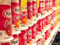
| 06/29/2004 01:58:56 PM | My favorite flavor?? My Choice Is Clear!by ChasSourekComment: Hi from the Critique Club.
It seems you gave some thought to this shot, which is nice. I like the angle and the dof. For the composition, I think it might be improved without the dark area in the bottom right corner.
I think technically, its done pretty well - with clear focus where you want it, good colors and exposures. The subject itself, I don't find interesting. Whether I like yogurt or not, I don't think I'd be inclined to put a photo of yogurt cartons on my wall.
It does meet the challenge and is an okay photo, but just lacks appeal for me.
Hope this has been helpful.
Judy |
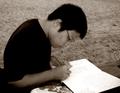
| 06/29/2004 01:44:33 PM | What to write...by AmiYuyComment: Hi from the Critique Club.
This will be a nice shot for you to keep of your friend.
When I first look at a photo, I try to determine which challenge it was from before actually looking at that information or the title. I really couldn't figure this one out. With the title, it helped me a bit to figure out choices, but it's not a strong connection for me.
Technically, I think there are some things that would improve the shot. The tones here seem dark and I'm not sure you could change the contrast much without really blowing out the white from the book pages. That being the case, I think your exposure might appear better if this was left in color. I think color might have done better to bring the emphasis onto the person writing.
The focus on the shot also appears a little soft to me. I would like better clarity on the face and the expression.
The composition is okay if you want a photo of your friend, but I'm not sure it conveys any kind of "story" or idea to the viewer. Maybe an angle more over his shoulder and getting more of the writing in the book would help? This composition would have worked better if the technical aspects were clearer and sharper I think.
I hope my comments were helpful and I hope you and your friends had a great time! |
| 06/29/2004 01:28:19 PM | COPYby GinaRothfelsComment: Hi from the Critique Club.
When I first view a photo to critique, I try to guess which challenge it has been from (without looking at the title or the challenge info.) I thought for sure this was from the desat challenge, as it appears that the green button is the focus of an otherwise grayish shot.
I was surprised to see it under "choices" because I just don't undertand what the choice is here? It's a dencent close up shot of the green button, but there's no interest here for me as the viewer. It appears to be more a sort of informative photo - such as you might find in the instruction manual for this device - to point out each feature.
That's really my only drawback to the entry - lack of interest.
I hope that my comments have been helpful. | | Photographer found comment helpful. |
|
Showing 1591 - 1600 of ~2606 |
Home -
Challenges -
Community -
League -
Photos -
Cameras -
Lenses -
Learn -
Help -
Terms of Use -
Privacy -
Top ^
DPChallenge, and website content and design, Copyright © 2001-2026 Challenging Technologies, LLC.
All digital photo copyrights belong to the photographers and may not be used without permission.
Current Server Time: 07/28/2026 02:53:59 AM EDT.
|