| Image |
Comment |
| 12/23/2004 11:20:52 PM |
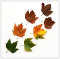
Journeyby gaurawaComment: This is a great idea and done very well. I'm not too sure about the placement of the leaves. Nothing really wrong with how they are, but I might like to see something a little spread out. I'm sure you tried lots of different looks.
White background for a minimal look was a good choice, imo. I would have liked the colors to pop just a little bit more against the white. Not sure how you would do that, since I"m not great at that sort of thing myself.
In any event...I do like the shot the way it is. Very creative. |
 Photographer found comment helpful. Photographer found comment helpful. |
| 12/23/2004 10:28:32 PM |
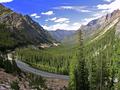
Washington Passby BeetleComment: This is breathtaking! I really like the colors and perspective. Did you use a wide angle on this? It looks just a little distorted, but that could be an illusion from the slopes of the hills. Other than that, I can find no fault! You should also make this available for print. |
| Photographer found comment helpful. |
| 12/23/2004 09:59:54 PM |
B major Barre Chord in Blueby orussellComment: I've always hated playing that chord :( I really like this shot, even without the connection to the challenge. Composition and lighting are both good...bringing your eye to the hand playing the chord. The blue tones gives it a feel of being at a concert. I also like the dof and the clarity the contrast gives the shot. IMO, you made all the right decisions on this one! |
| Photographer found comment helpful. |
| 12/23/2004 09:55:47 PM |
Candid Girlby TranquilComment: This is a great shot! I love those curls and that tongue sticking out! Kid shots are so much better unposed. Lighting and blurred background make this a nice shot technically. I wouldn't change a thing! |
| Photographer found comment helpful. |
| 12/23/2004 09:52:06 PM |
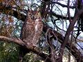
Mesquite, Mistletoe, & Merlin the Magician (Great Horned Owl in the wild)by scrum8Comment: What a great capture of this guy! How close were you? I would have cropped it vertically and blurred the background some to isolate the owl a bit more. I really like the angle of the two large branches, and the way he's looking right at you. I might also experiment with some dodging and burning to see about setting him apart and making the eyes pop a bit more.
All that being said, I really like it just the way it is as well! |
| 12/23/2004 09:05:30 PM |
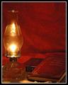
The Lamp, The Spirit, and the Sword.by ArcanistComment: I really like the set up you have here. The idea, the tones and the combination of elements is really nice. Yes, some things could have been improved. The background would be better if a little smoother, or without the crease at the bottom in back, however the color is perfect. I would lose the doily thing under the lantern. Other than that, I might like just a bit more space on the left of the lamp.
The lighting you got from this is really nice. I might like to try to highlight the book titles somehow - maybe a slight dodge? Nice shot (and excellent choice of reading :) ) |
| Photographer found comment helpful. |
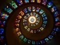
| 12/23/2004 08:01:04 PM |
12274058-L.jpgby L1Comment: This is so cool! Is this the same location where Danny has taken his shots? Where is it? I like how the spiral starts all the way at the bottom at the left corner of the photo. I'm glad you didn't cut it up higher. I have liked a couple of Danny's where you can see more of the wall, but I like the version too. It highlights the stained glass nicely. Really pretty. |
| Photographer found comment helpful. |
| 12/23/2004 05:57:01 PM |
|
| Photographer found comment helpful. |
| 12/23/2004 05:51:47 PM |
|
| Photographer found comment helpful. |
| 12/23/2004 05:50:32 PM |
|
| Photographer found comment helpful. |
Home -
Challenges -
Community -
League -
Photos -
Cameras -
Lenses -
Learn -
Help -
Terms of Use -
Privacy -
Top ^
DPChallenge, and website content and design, Copyright © 2001-2026 Challenging Technologies, LLC.
All digital photo copyrights belong to the photographers and may not be used without permission.
Current Server Time: 07/27/2026 02:12:28 AM EDT.