| Image |
Comment |
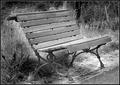
| 07/30/2005 05:08:10 PM |
Old benchby NunoComment: a bit rough on the dodging but nicely composed |
 Photographer found comment helpful. Photographer found comment helpful. |
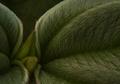
| 07/25/2005 07:56:13 AM |
Violet Budby enticingComment: you've really captured the fuzzy feel - lighting mutes the tones and adds mood and depth --- one of my ribbon picks |
| Photographer found comment helpful. |
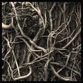
| 07/25/2005 07:55:28 AM |
Intertwinedby cheekymunkyComment: good choice of sepia tones as they really bring out the depth and patterns -- one of my ribbon picks |
| Photographer found comment helpful. |
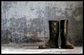
| 07/25/2005 07:54:40 AM |
Faithful Servantsby NazgulComment: wonerful backdrop for these two weathered boots... placement in the frame works well -- one of my ribbon picks |
| Photographer found comment helpful. |
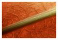
| 07/25/2005 07:53:37 AM |
Stem and Leafby JackoComment: lovely tones and composition - border is a bit too wide and white has it stand out too much imho - one of my ribbon picks |
| Photographer found comment helpful. |
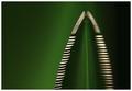
| 07/25/2005 07:52:18 AM |
Serratedby redmoonComment: excellent use of light and color - one of my favorites this challenge |
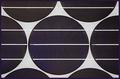
| 07/24/2005 11:56:09 AM |
Solar Filterby undieyatchComment: Didn't get a chance to vote on all entries and missed this one. I like the geometry, gray/black colors -- would like a bit more symetry in the upper 1/3 of the frame (minor point as the rest of the framing works) -- subject is too flat and lack dimention or interest to make it stand out from all the entries (600+) so I probably would have scored it 4-5. (PS I appreciate your candor and notes on my circle entry!) |
| 07/13/2005 10:19:20 AM |
Cactus Jackby tfaustComment: Ingrid's right on the exposure aspects. I'd like to see the whole image burned a bit even if the face goes way dark -- could work as an "every-cowbow" study. The sepia is a great choice as it adds to the mood (old western). |
| Photographer found comment helpful. |
| 07/13/2005 10:15:58 AM |
Retiredby tfaustComment: B/W Club:
I second all of Ron's comments! This is fine "fill the frame" shot and a good use of B&W that brings out form, texture, etc. |
| Photographer found comment helpful. |
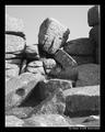
| 07/11/2005 03:37:55 PM |
The Thinkerby KaveyComment: B/W Club!
Can't add much more than Rob's comments. The vacant, gray sky feels like a void with all the angular forms and frame-filling detail. Maybe it is the thick, black border that's highlight that for me?? I find the shadows and their play amongst the rocks to be very interesting -- b&w strengthens that element. |
| Photographer found comment helpful. |
Home -
Challenges -
Community -
League -
Photos -
Cameras -
Lenses -
Learn -
Help -
Terms of Use -
Privacy -
Top ^
DPChallenge, and website content and design, Copyright © 2001-2026 Challenging Technologies, LLC.
All digital photo copyrights belong to the photographers and may not be used without permission.
Current Server Time: 07/23/2026 10:03:04 AM EDT.