| Image |
Comment |
| 09/18/2005 01:34:19 PM |
High in the Carolina Skies.by tolovemoonComment: Greetings from the Critique Club...
You score reflects the "where's the connection" for sure. I'll try not to repeat what's already been pointed out, not commenting on the contest connection but rather the shot itself (I didn't vote on this image but I'd have to agree on the contest disconnect)
I found the repetition of geometric shapes and simple colors (blue, red, yellow) a plus. Aligning the lamp vertical and horizontal lines adds to this effect. This lower/central part of the frame is the most interesting.
I'm struggling to see a main subject or story so I'm left with disconnected images and no way to pull them together. The shot looks "chopped" as the bottom elements are cut off (building, trees, and pole) while there's a bit too much blue sky throwing off the balance.
Please keep in mind this is only one woman's pov :)
Email me with any questions or comments. I enjoyed browsing through your other challenge and portfolio entries and found lots to like. I look forward to seeing more entries! Happy shooting
Theresa |
| 09/18/2005 10:23:47 AM |
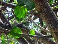
Still Greenby amyrhComment: Greetings from the Critique Club...
I'm sorry but I don't have a lot to add from the comments you've received so far. I think the reasons given are probably the ones that had you score lower in the challenge:
- no clear subject(s)
- bit too similar to other entries
- wide DOF so background and foreground compete for attention
For "frame-filling" shots (i.e. ones without a clear subject and even dof) to work, I like to see a more consistent item (in this case it would be leaves OR branches) so there's some unifying element. Here my eye jumps randomly over the image but there's no pattern(s) that satisfy.
If you have any questions or comments feel free to send me an email.
Happy Shooting,
Theresa |
| 09/18/2005 10:12:36 AM |
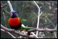
a good place to restby theflyComment: Greetings from the Critique Club and congrats on the high placement and score.
Obviously a solid image. I've read through the many comments you have already and will try not to repeat.
Suggestions: the midground is the weaker area (as the dof and bird are excellent) It's a bit cluttered with light colored branches and distracts my eye from the subject. The branch "growing" out the of the bird's head weakens the composition as well. I offer these observations not because you could necessarily control where the bird lands but more from a "here's what detracts" pov. Cropping out the right stick (from about the center and to the right edge) might simplify the compostion and remove some of the clutter -- just a thought.
Again, strong image and the suggestion is only one woman's opinion.
Please email me with any questions and Happy shooting :)
Theresa |
 Photographer found comment helpful. Photographer found comment helpful. |
| 09/18/2005 09:11:37 AM |
|
| 09/18/2005 09:11:03 AM |
|
| Photographer found comment helpful. |
| 09/18/2005 09:10:15 AM |
|
| Photographer found comment helpful. |
| 09/18/2005 09:08:52 AM |
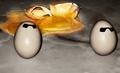
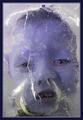
Paranoiaby glodaComment: your model's expression makes this shot :) one of my favorites this challenge |
| Photographer found comment helpful. |
| 09/18/2005 09:08:15 AM |
|
| Photographer found comment helpful. |
| 09/18/2005 09:07:18 AM |
|
| Photographer found comment helpful. |
| 09/18/2005 09:06:50 AM |
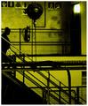
Chemtrailsby whiteroomComment: nice use of dual tones, figure makes the point, one of my ribbon picks |
| Photographer found comment helpful. |
Home -
Challenges -
Community -
League -
Photos -
Cameras -
Lenses -
Learn -
Help -
Terms of Use -
Privacy -
Top ^
DPChallenge, and website content and design, Copyright © 2001-2026 Challenging Technologies, LLC.
All digital photo copyrights belong to the photographers and may not be used without permission.
Current Server Time: 07/23/2026 07:42:58 AM EDT.