| Image |
Comment |
| 12/29/2005 03:44:34 PM |
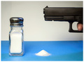
A Salt with a Deadly Weaponby mpetersComment: Greetings from the Critique Club
You found a good pun, illustrated it well and were nicely rewarded by our voters (including me).
Your commentors mentioned the blue surface. I tend to agree; this image could also have done really well in black and white. That might have evened out the shadows as well.
Then, this image seems to be just a bit soft-focus. You might consider what impact your image would have if those grains of salt, and the printing on the barrel of the weapon were tack sharp.
Still, all in all, a good entry and one the voters liked.
I wish you well in future Challenges. |
 Photographer found comment helpful. Photographer found comment helpful. |
| 12/28/2005 11:09:04 PM |
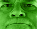
Scowl-Vert (scalvert)by banmornComment:
Greetings from the Critique Club
Don't cha just hate it when you have ta explain your puns?
Seriously, you have a good pun going here and good photography to go with it. It must have been difficult to keep a straight face (scowl) while the timer clicked away. I like the green / vert cast to the image and overall I like the composition. Perhaps it could have been just a touch stronger with more of the eyebrows in the frame.
I suppose this was the victim of those of our more hurried voters who didn't take the time to find the story and joke in this good image. But I expect you are pleased with the image and that is what counts.
Not bad, banmorn, not bad. |
| Photographer found comment helpful. |
| 12/28/2005 10:52:18 PM |
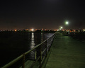
Piering Outby Mr_BondComment: Greetings from the Critique Club
Your first Challenge, and you did quite well. That's a good score.
The voters liked your pun (I do as well) and they liked your photography. As well they should. You saved it nicely from the dreaded half 'n half exposure that slices an image in half since you placed your horizon just above the center line.
The image is crisp and properly exposed. I expect that if you were able to take a more spectacular image of Melbourne's skyline or had something on the pier that would have given this image the needed "wow" factor, you would have placed even higher than you did.
Still, this competent and interesting photograph did well and you should rightly be proud of the results of your first DP Challenge.
I'll look forward to seeing more of your work. |
| Photographer found comment helpful. |
| 12/28/2005 09:48:31 PM |
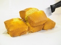
For Baking Luck -- A Four Loaf Cleaverby karmatComment: Greetings from the Critique Club
Nope. I didn't laugh. First I cringed, then I laughed. Good puns make me do that. Besides, I like cornbread - a lot, and this shot made me drool.
I like the composition. A nice diagonal in the frame in this case, works well to keep the viewer interested. Color is good and all is in good focus (if you'd been able to get the crumb in the cut cornbread in really sharp focus it would have been spectacular).
While there is a lot of white grounding being used in the Challenges these days, I personally find it a little unsettling in this case. The substantial cornbread seems to cry out for a good foundation. Perhaps a wooden cutting board, for example.
In any event, you scored quite well on this entry, the pun is terrific and you obviously had fun doing it.
What more can we ask of an entry!
|
| Photographer found comment helpful. |
| 12/28/2005 12:22:48 PM |
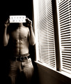
Misunderstoodby TranquilComment: Greetings from the Critique Club
What a fun-loving image this is. Yes the pun is right there, up front and (as it were) in your face. I like the unconventional framing and the excellent way you used light. The blinds have their own interest yet relentlessly direct the viewer to the subject - that sign and you!
While you received a pretty good score, I have the feeling that some of our more hurried voters just couldn't be troubled to stop and find the story that is so well interpreted here.
Keep up the good work and win some more ribbons.
|
| Photographer found comment helpful. |
| 12/28/2005 12:10:08 PM |
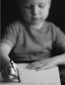
Dear Santaby Prof_FateComment: Greetings from the Critique Club
You were well rewarded by the voters for this very nice image. It certainly meets the requirements of the Challenge perfectly and is beautifully interpreted.
I like the good sharpness of the model's hand along with the good definition of the printing fading very abruptly to the blurred out background. The forward placement of the in-focus features works very well.
The interesting part here, is that the intense concentration of your model shows through even through the blur. This adds to the tension and the story telling atmosphere of the image, and perhaps gave the extra 'wow' factor to this image.
So, I congratulate you on an excellent image and on maintaining the interest of your young model through what must have been multiple exposures.
|
| Photographer found comment helpful. |
| 12/28/2005 11:57:53 AM |
|
| Photographer found comment helpful. |
| 12/28/2005 10:55:59 AM |
|
| Photographer found comment helpful. |
| 12/28/2005 10:30:33 AM |
|
| Photographer found comment helpful. |
| 12/27/2005 08:04:52 PM |
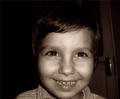
cheeeeeeeseby violetaComment: Greetings from the Critique Club
Oh dear,Oh dear, Oh dear! I have read your comments and it appears some of our voters have limited vocabularies and lack the ability to define words.
Okay, nothing we can do about that now. This is a totally appealing image of a little kid with a (sort of) cheesy smile. He's too cute to make it come off, really. Nevertheless, it, in my opinion, does meet the Challenge.
Compositionally, I like it, mostly. The door handle is intrusive; it would have been better if you could have blocked it off. And of course, for framing purposes, you can do that now. This image cries to be framed and shown off. I do like the muted white of the door. Perhaps you could blur the whole thing out so just a suggestion of light remains.
Then, the child's chin is close to the edge of the frame. You might think about leaving more space there so he doesn't look cut off.
I'll look forward to seeing more of your entries in DPChallenge. |
Home -
Challenges -
Community -
League -
Photos -
Cameras -
Lenses -
Learn -
Help -
Terms of Use -
Privacy -
Top ^
DPChallenge, and website content and design, Copyright © 2001-2026 Challenging Technologies, LLC.
All digital photo copyrights belong to the photographers and may not be used without permission.
Current Server Time: 06/22/2026 10:24:25 AM EDT.