|
|
|
Showing 7081 - 7090 of ~8912 |
| Image |
Comment |
| 01/03/2006 08:28:49 PM | |  Photographer found comment helpful. Photographer found comment helpful. |
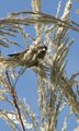
| 01/03/2006 02:57:15 PM | Christmas Glowby fplouffeComment: Greetings from the Critique Club
Before I start this Critique, I must compliment you on your Hawk image from a previous Challenge. It's splendid.
Okay. Back to Christmas Glow. You met the challenge nicely with the in-focus pine cone and out-of-focus greenery and that other ornament to the left. But as I look at this image, I wonder if you really need the left side of this photo at all. You have a good composition and meet the Challenge requirements well with just the greens and the pine cone. It's pleasant to look at.
What happens with the added material on the left, is that the viewer goes over there to see what's going on. There's nothing exciting, really, so, distracted, the viewer loses interest and moves on.
In any event, your images does capture a nice Christmas Glow.
I wish you continued success at DPC and look forward to seeing more of your work. | | Photographer found comment helpful. |
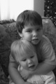
| 01/03/2006 02:41:10 PM | Pnigophobia (Fear of being choked)by mandradeComment: Greetings from the Critique Club
Isn't it fun to have your own staff of models! I enjoyed looking at your kids who probably get along just fine when not called upon to choke one another. ;>)
The composition on this image is a little weak. You might consider using a drape or a throw of a solid color as a backdrop for the children. The present cloth patterns, the window and the dark area compete for attention and draw away from the story you are telling.
Then, and I know this is difficult with kids, your image is just a touch soft-focus where I think a good sharp image would be a plus. Consider using a tripod if you can. And of course, if you used a backdrop, and could move your composition so as to put that window to one side, you would have better lighting on the kid's faces.
I'm pleased to have the chance to look at another of your images for the Critique Club and I'll look forward to seeing more as time goes on.
Best regards. |
| 01/03/2006 02:26:12 PM | Claustrophobiaby middelboschComment: Greetings from the Critique Club
Congratulations. You have created a fine image that met the challenge beautifully, is technically good and scored well.
You have received many comments on your photograph which makes it difficult to add anything new to this commentary. However, I will say that the border you chose suits the image perfectly. I am usually not a fan of large, black borders. Why? Because they make me feel claustrophobic! As if the image within is being imprisoned. Well, just what you wanted, right?
Okay. All I can add is, "keep up the good work." | | Photographer found comment helpful. |
| 12/31/2005 10:44:40 PM | | | Photographer found comment helpful. |
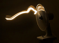
| 12/30/2005 05:11:33 PM | Light Fanby JasComment: Greetings from the Critique Club
You have a very interesting image here, that is well composed and nicely executed.
It's a little difficult to tell just what the pun is in this picture and that may have put a dent in your score. The reason for the light to be in front of the fan is just a little obscure.
It was an interesting technical challenge for you and you pulled it off quite well. YOur notes tell me you hit the fan with the lightbulb. There are no shards. My curiosity makes me ask: I wonder what happened to them...
In any event, you have an interesting image here, and with a little more excitement in your visual storytelling, and a more visible pun, you might have done very well with this.
I'll look forward to seeing more of your work on DPC.
|
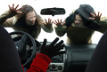
| 12/29/2005 06:50:12 PM | Window Jamby ColeyComment: Greetings from the Critique Club
YOu have a beautifully executed image here, one that was difficult to achieve. (But that hasn't stopped you before - your work seems to thrive on degree of difficulty)
The composition is perfect with the red sleeve directing the viewer to the action on the windshield. Your kids make excellent actors. Technicals seem to be just fine.
I suppose your score would have been closer to the front page if people could have figured out the pun (I couldn't either) but you came through nicely on other factors.
Continued good luck to you in future Challenges. | | Photographer found comment helpful. |
| 12/29/2005 06:39:22 PM | Laertes' Poisoned Bladeby labudsComment: Greetings from the Critique Club
You have a perfectly executed photograph here that was richly rewarded by our voters.
While the pun (perhaps an obscure one) puzzled our voters they gave you full marks for originality and superb photography.
There really isn't much to critique in this image, except to reiterate what you did right. So with thanks for the chance to look at this image again closely, I'll move on to the next Challenge entry in the queue.
I wish you continued success in DP Challenges. |
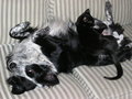
| 12/29/2005 04:17:16 PM | Deferredby rayz1Comment: Greetings from the Critique Club
Terrific pun, terrific cat, good photography. Great score. What more could you ask!
Certainly this is an appealing image; one that sparked the interest of many voters, and rightly so. The cat's (pi**ed) expression was worth extra points right there.
With animals, you take what you can get, but this is a bit of a close crop on the top of that magnificent head of Netta's. I think you get away with it because of the great center of interest in Netta's eyes, and of course, the bald behind.
So, congratulations on a fine image and keep up the good work. | | Photographer found comment helpful. |
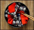
| 12/29/2005 03:59:13 PM | Thai food by LevTComment: Greetings from the Critique Club
Congratulations on your Yellow Ribbon. You have an impeccable image here and the voters (including me) rewarded you handsomely for it.
Your attention to detail, coloring and composition are just fine.
While this Critique is one of the easiest ones I've ever attempted, and it was a pleasure to examine this fine photograph again, I think it's time to move on to the next image in the queue.
Again, congratulations on a fine entry. | | Photographer found comment helpful. |
|
Showing 7081 - 7090 of ~8912 |
Home -
Challenges -
Community -
League -
Photos -
Cameras -
Lenses -
Learn -
Help -
Terms of Use -
Privacy -
Top ^
DPChallenge, and website content and design, Copyright © 2001-2026 Challenging Technologies, LLC.
All digital photo copyrights belong to the photographers and may not be used without permission.
Current Server Time: 06/22/2026 10:24:23 AM EDT.
|